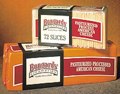
The Bongard, MN-based creamery had strong name and brand recognition in the foodservice market, but wanted to increase its awareness with consumers, particularly with its premium cheeses sold in grocery store deli cases. One of Compass’ goals was to avoid the overused dairy images. For the cheese packs, Compass designers decided to use flexo-graphic printing for a new eye-catching logo on pressure-sensitive labels, and to direct-print the clear film packaging. Designers chose an existing font and hand-rendered it to make it unique to Bongards’. It’s a traditional look, fitting with Bongards’ 93-year history. Background color consists of a cream color block overlaid on a black rectangle, providing enhanced shelf impact, another goal of the design team. The logo type comprises rust and green colors. “After 30 years using the same logo, we were ready for a change,” says Stu Kringen, Bongards’ sales manager. “This is exactly the type of fresh, updated look we were looking for. Compass did an outstanding job.”