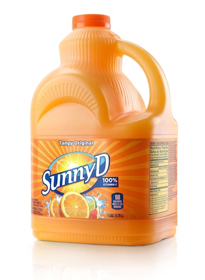
“Pourgonomic,” “store-rific,” and “bling-friendly”: These are just a few of the tongue-in-cheek adjectives applied to the new 1-gallon SunnyD citrus punch bottle in new TV advertising that places the focus “squarely” on the new packaging. In development since mid-2009, the new rectangular-shaped container, designed to be easier to pour and easier to store, is a prime example of a new trend toward greater thoughtfulness in package design, says Peter Clarke, CEO and founder of design and innovation firm Product Ventures.
“Here is such a mindset change,” says Clarke, who led the structural development of the new SunnyD bottle for Cincinnati-based Sunny Delight Beverages Co. “Historically, everyone viewed packaging as an expense. Now it’s truly starting to be viewed by brand owners as an investment in their product offerings. I am really excited for our industry.”
The goal of the redesign of SunnyD’s existing round gallon bottle—introduced in 1993 to provide consumers with a larger container size—was to address a number of ergonomic and marketing challenges presented by the design, explains Rick Zimmerman, senior vice president of marketing and innovation for SDBC. “We wanted to square-up the bottle so that we could use a registered label that would face forward,” he says. “We also wanted to retain the key iconic design features that consumers associate with Sunny D: the neck angle and fluting. And, we wanted to improve the ergonomics related to the handle fit and pourability.”
Following ergonomic breakdown studies, iterative modeling, internal hypothesis testing, and consumer testing by Product Ventures, a new “squared-up” bottle structure incorporating the iconic SunnyD brand equities was developed that also provides for greater efficiencies and cost savings within the supply chain.
Easier to pour
If the new 1-gal SunnyD bottle is described as “pour-mazing,” the former bottle could have been called “spill-tastic.” According to Clarke, several features of the round container made it difficult to handle—especially for kids, the brand’s primary audience. One drawback was the bottle’s centered neck, which required the consumer to tip the bottle further in order to get the liquid to pour. “To have to tip a long way means you have to swing all that mass of bottle with your hand,” he says. “It creates a lot of strain.”
Pour aim suffered as well due to the position of the spout: “Having the spout centered takes it further away from the edge of the glass, and you still have all that mass of the bottle that might be bumping into the glass,” adds Clarke.
Another downside to the bottle design was the placement and size of the handle, which could accommodate at best three fingers. “Having the handle positioned high on the bottle means you have to swing all that weight,” says Clarke, “so you didn’t have a lot of control.”
The solution was an offset spout and an easier-to-grip, strategically positioned handle sized to fit at least four fingers, making it “bling-friendly,” as SunnyD jokingly touts, for consumers wearing rings. These changes were proven out with ergonomic breakdown studies, iterative modeling through computer illustrations and diagrams, and ultimately consumer testing. Product Ventures’ signature testing method, the Consumer Workshop, features mockups of actual retail and usage environments in which consumers interact with prototypes; two-way mirrors and recording equipment that allow the designer and brand owner to observe the consumer; and on-site prototyping equipment that lets Product Ventures make changes on-the-spot in response to consumer feedback.
The SunnyD Consumer Workshop included replicas of a Walmart retail environment with coffin coolers that allowed the designer and brand owner to observe consumers extracting hollow, stereolithographed bottles filled with liquid from the “ergonomically challenging” refrigerated coolers—the highest-volume retail fixture through which the SunnyD 1-gal product is sold, according to Clarke. The workshop also featured a kitchen pantry and a number of refrigerator types, which helped the design team with its next goal: an easier-to-store bottle.
Easier to store
SDBC’s motive in making the 1-gal bottle easier to store in the refrigerator door was not only greater consumer convenience, but also—and perhaps more importantly—increased brand visibility. Traditionally, the round bottle was stored on the top shelf of the refrigerator where, Clarke notes, it might be pushed to the back, ending up a “fridge fossil.” From Product Ventures’ previous work developing the Heinz ketchup Fridge Door Fit™ bottle in 2006, it had learned that “by re-proportioning the package to fit in the fridge-door pocket, it could drive sales by keeping the product front and center like a reminder, ‘Hey, do you want ketchup with that?’”
“The fridge door keeps the product easily accessible, especially if you can get it into that lower fridge-door pocket,” says Clarke. “Then it becomes even more kid-accessible.”
Changing the bottle shape from round to square was the first step in making the container more fridge door-friendly. The next was settling on a dimension that would be compatible with the greatest number of refrigerator styles. “Our goal was to create a common-denominator dimension,” says Clarke. “We measured all the refrigerators on the marketplace, plus refrigerators yet to come to make sure that what we created would have longevity.”
More efficient and sustainable
Inherently easier to store, the new square shape of the bottle also provides a more optimized footprint for palletizing and retail display, as well as greater structural integrity, which has resulted in significant supply chain efficiencies and cost savings.
According to Zimmerman, “The square shape enables many retailers to fit another row on the store shelf, reducing labor costs, since shelves can be restocked less often.” In addition, the square shape allows SDBC to stack pallets four layers high, versus the previous five, with three more containers per pallet, optimizing cube efficiency.
The square shape also delivers greater structural integrity and top-load strength, whereby weight is distributed out to the four corners of the bottle. This has allowed SDBC to switch from corrugated cases to trays for its secondary packaging, resulting in the reduction of 12 million lb of corrugated per year. Confirms Zimmerman, “The square bottle is more sustainable as it’s being manufactured and distributed using less corrugated and waste.”
More Sunny ‘Delight-full’
As mentioned, one of SDBC’s requirements for the new design was the inclusion of established design features—the neck angle and fluting—modeled after elements that SunnyD had been using in its smaller bottles since the introduction of the brand in 1964.
“Packaging is very important to the SunnyD brand,” says Zimmerman. “In a number of studies, consumers have been able to identify SunnyD just from the silhouette of our bottle. In fact, we have the second most-identifiable shape in the beverage market.”
With the new bottle design, Product Ventures not only preserves these signature equities, but also accentuates them. “There was an equity element that they had on their large gallon that we replaced,” says Clarke. “It’s a kind of rib array on the somewhat crown-shaped top that’s right where the pour spout is. We actually accentuated that crown to make it even more regal, but we also beveled it to give it more top-load strength.
“The ribs are a nice play off the rays of sunshine in the label graphics. And, if you think about the retail reality, when the consumer looks down into that coffin cooler, all they see is the tops of these bottles. With the ray pattern of ribs, it gives you a nice sunburst design. Having the ribs also helps maintain structural integrity while minimizing the amount of plastic needed to blow-mold the bottle.
“Also aesthetically, we created a crescent-shaped brow, otherwise known as the catenary arch, above the label panel. The arch really plays off that elliptical icon of the SunnyD logo, with the rays of sunshine around it. Again, it’s like the rising sun. The element is iconic while at the same time providing structural integrity to the shoulders of the bottle.”
The bottles are extrusion blow-molded of high-density polyethylene by ALPLA, Consolidated Container, and Madras Packaging. According to Zimmerman, label graphics were modified for the new bottle, but maintained a design of dynamic “rays” that was created two years prior for the brand.
New packaging equipment needs
To enable the launch of the new package throughout the U.S. by the end of June 2012, SunnyD made a significant investment in upgrades at its four manufacturing facilities. While SDBC does not wish to elaborate on details of this investment, Clarke notes that running a square bottle with an offset neck on a packaging line presents several challenges not associated with a round container.
For instance, round bottles can easily be managed on accumulation tables to maintain line speeds, whereas accumulation tables cannot be used with a square bottle. An off-centered neck requires that bottles are oriented correctly when they go into the filler, whereas bottles with a centered neck do not require orientation. “That being said,” Clarke notes, “the efficiencies in distribution with the new bottle all outweigh the negatives associated with the square shape.”
This is an important point to note, he says, as it exemplifies the shift in thinking that is taking place among brand owners, who are beginning to look at package design from a more life cycle-based approach. “Back when everyone viewed packaging as an expense, the knee-jerk reaction to this new design would have been, ‘I can’t lose my accumulation table, and now I have to orient the bottles,’” says Clarke. “In this case, they realized the cost tradeoffs of the distribution efficiency of rectangular versus round, as well as the lift potential for selling more product and having a story to tell in their advertising.
“I am really happy that the 360-degree due diligence of viewing every aspect of the package and its life cycle from manufacture to distribution to the benefits to the end consumer were taken into consideration so that the right configuration could be brought to market.”
As seen on TV
In the new SunnyD Easy to Store TV spot, the scene opens with a woman frantically struggling to fit a generically labeled, bleach-shaped bottle into her fridge door, as 1950s-style music capers in the background. As the announcer notes, with less convenient container shapes comes a disorganized fridge. A “Before” shot shows a refrigerator with food and packages spilling out, and a chirpy raccoon settled amidst the mess on one of the fridge shelves. But the new SunnyD Square Bottle—“designed by expert squareologists”—makes all of this hassle and mess a distant memory: Note the clean and organized fridge in the “After” shot.
“These commercials are hysterical,” says Clarke. “It is just so neat to think that packaging is the subject matter. Seeing this is a real testament to packaging coming into the forefront as part of the marketing campaign.”
Says Zimmerman, “The thought process for the advertising was actually very easy. It is very simple, and came from the mouths of consumers: ‘Easier to pour, easier to store.’
“Both retailers and consumers have responded positively to the new bottle in light of the benefits it delivers. It’s a win/win for all involved parties.”
