But what a difference a label makes—the result is both differentiation from the competition and from each other.
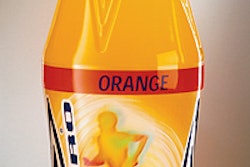
Billed as the “ultimate energy drink,” ultrafueL was reintroduced in early 2002 in dramatically revamped packaging. Gone were the glass bottle, pressure-sensitive label, and metal lug closure. That generic-looking package was replaced with a sportier 18-oz PET bottle with grip handles and a partial see-through shrink label printed in eight colors. TwinLab’s graphics designer Chris Harri, who worked on the project, points out that the pattern molded on the helical grip handles—which extend halfway up the bottle—mimic the tread design on weight benches to further reinforce the products’ athletic imagery. It also improves the bottle’s grippability.
The bottle’s smooth upper portion and gripping bottom portion appear as if formed of two different bottle halves welded together. Harri points out that the undercut between the two sections was designed to make it easier to apply the wraparound label between the bottle’s shoulder and waist. A stock plastic white 38-mm tamper-evident plastic closure tops the bottles. The product retails for $1.99.
Fueled up
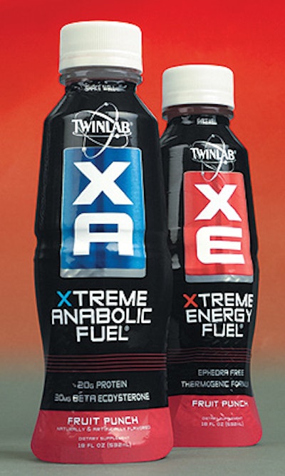
For XA “Xtreme anabolic fuel” and XE “Xtreme energy fuel” drinks, that same bottle is hidden behind a colorful full-body shrink sleeve printed in 10 colors.
Why the same bottle? “We’d spent a lot of money and time in that bottle design and didn’t want to ‘lose’ it,” says Harri. “This keeps it going to reinforce the design as a symbol for us.” Perhaps there are economic advantages in buying in larger quantities, too.
What it loses in grippability it makes up for in looks. Harri says the bottle “stands out in a sea of products. Our bottle is a little taller, a little sleeker than the others.”
Unlike the translucency of the ultrafueL label, the Xtreme label is opaque, and printed with black ink. That’s because the product itself “isn’t as beautiful nor does it have the flair of ultrafueL,” acknowledges Harri. “But wrapped like this, it’s beautiful.” Introduced nationally this year, XA retails for $3.49 and XE for $2.49. —RL