In the nine years since organic and natural foods company Pacific Natural Foods, Tualatin, OR, updated its logo, package graphics for its liquid cartons of soup broth and non-dairy beverages had taken on a piecemeal appearance—with inconsistent colors, typography, and logo treatment.
“Things had been evolving and changing in small ways over the years, and we were looking to modernize the brand and have a consistent look across all product lines,” says Pacific's marketing communications manager Jennifer Herrick.
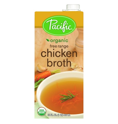
Consumer studies conducted in early 2011 showed that certain elements of Pacific's packaging were recognizable, including the green hue, oval shape, and simple, cursive script of the brand logo. Consumers also indicated that they liked the fresh product and ingredient imagery shown on-pack. But packaging inconsistencies “made the products difficult to locate in the store,” reveals Herrick.
Working with Michael Osborne Design, Pacific devised a design scheme of different color bands to differentiate flavor varieties, along with updated product imagery that provides a more uniform appearance on shelf and “brings a fresh look to a brand that cares about using fresh, organic ingredients,” says Herrick. The logo has been contemporized, with its most recognizable elements retained. Back-panel copy better communicates the Pacific brand story and core values, while QR codes provide usage ideas and recipe suggestions when scanned with a smartphone.
Says Kevin Tisdale, director of marketing for Pacific Natural Foods, “With the new brand imagery and color cues across all of our flavors, now you’ll see a stronger block of Pacific products on the shelf, making it easier for shoppers to find and buy their favorites. We expect the recipe ideas accessed by the QR codes to also contribute to a higher basket ring for retailers.”
The new packaging is scheduled to be on store shelves nationwide by mid-2012.