As consumers become savvier shoppers, marketers need to communicate their brands’ key selling benefits differently. Twenty years ago, it may have been enough to slap a “sugar-free” or “vitamin-enriched” starburst on a package to get someone’s attention in the supermarket aisle. But today, every box, bag, and bottle makes one or more claims, to the point where it can warrant negative publicity. Worse, it could drive angry and mistrusting consumers to tweet, rant on blogs, and—gasp—unfriend you on Facebook! Even brands like SunChips, which tried to blaze a new trail with its groundbreaking compostable packaging, heard loud and clear over the Internet that consumers did not entirely appreciate its bags, which were very noisy.
So what’s a brand to do? Given that purchasing decisions are made in an instant, how can package design work to help marketers tell their brands’ story, educate consumers, and stand out…in an instant? Here are five lessons learned from package design to help guide your efforts.
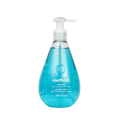
Lesson #1: Tell a simple, compelling story. Jaded by all the marketing claims of the past decades—everything from “sugar-free” to “fiber-rich” to “probiotic”—consumers are now seeking out more minimal design, straightforward visual cues, and honest, authentic copy. Method, with its “good for you, good for the planet” message, creates minimalist yet beautifully designed products that are not only good for the environment but also meant to be displayed in homes.
Gone is the image of “green” as bare-bones (hello, Seventh Generation). The Method product line, with its brightly colored packaging; unconventionally shaped bottles; and friendly, lowercase logo; unquestionably is modern and approachable. Package copy is straightforward and minimal, with the occasional wink, and it conveys the product’s benefits elegantly and concisely. Quite simply, Method noticed a niche in the category and nailed it.
Lesson #2: Do something unexpected to grab shoppers with short attention spans. In the age of the Internet, branding messages bombard shoppers with information. They can’t focus for a single minute, let alone several. The days of reading package copy in the aisle are long gone; now, you really need to grab consumers at first glance. For this reason, packaging must be bold, in a refreshing, innovative way and make people say, “Wow!”
When CBX was helping Kimberly-Clark create its U by Kotex brand, the creative team got out into the field, turned over every stone, and really tried to think “out of the box” (pun intended) to create packaging that would alter the public image of Kotex. Research showed that the feminine-hygiene category had been dominated for the last 50 years by pastel hues, script typefaces, and discreet language, and also that this approach is no longer relevant to a 21st century woman, who is anything but shy.
Building on cues found in fashion, U by Kotex’s black matte packaging is highlighted by bold bursts of color and high-gloss circles. The copy tone that is at once both honest (our target consumer wanted straight talk) and informative (highlighted by a “Myth or fact?” section on the back panel that discarded old-fashioned notions of what happens to women during their periods). The brand also had the chutzpah to use the word vagina—previously taboo in the category.
Lesson #3: Educate and entertain. In the age of the Internet, CPG companies can no longer pull the wool over consumers’ eyes with inflated, and even false, packaging claims. In addition to possibly losing sales, you also can find yourself in big trouble with the Food and Drug Administration. That happened to Nestle last summer, when the FDA cited the food and beverage company for claiming that its Boost Kid Essentials Nutritionally Complete Drink provided “immunity protection” for children against colds and the flu. But VitaminWater, a line of enhanced waters from Glaceau, now a privately owned subsidiary of Coca-Cola, struck the perfect balance between “educate” and “entertain.” A clean design and smart, witty, conversational copy convey the product benefits. For example, the brand’s “energy” drink, which contains guarana and Vitamin B, bears this copy:
“In soccer (excuse us Mexico, Spain, and Italy, we mean ‘futbol’), there isn’t a more exciting moment than when the announcer screams ‘gooooooal’ (yelling ‘offffsiddde’ never quite caught on). With that said, we added Vitamin B and guarana to give you an extra kick (pun intended), so now when you’re watching soccer, playing soccer, coaching soccer, driving kids to soccer or doing anything that starts with ‘socc’ and ends with ‘er,’ you too can have the energy of a raving lunatic to yell ‘gooooooooal!’”
As opposed to packages bombarded with claims, bursts, and violators, VitaminWater’s editorial-style graphics immediately draw attention, and its informative, witty copy was groundbreaking for the beverage category. Is it surprising that VitaminWater has become one of the best-selling enhanced waters?
Lesson #4: Have a big idea. When Duane Reade approached CBX to develop the expression of its private-label brands’ new positioning, “New York Living Made Easy,” the result was approach that would get even the most cynical New Yorkers to sit up and take notice. The creative team looked at every uniquely New York experience and then incorporated these experiences into the package designs.
Two examples: Spectacular Chocolate Chip Cookies feature a theatrical spotlight shining on appetizing product shots. Deluxe Whole Cashews cans whimsically position the cashews on bar stools and park benches.
This idea of uniquely New York is evident across all of Duane Reade’s private-label products, and it is reinforced throughout the on-pack copy with a dry, sarcastic tone that easily could have come out of the mouth of any New York City taxi driver. Additionally, Duane Reade now offers a value line of products that utilize UPC-style illustrations of New York Landmarks, from the Statue of Liberty to the Brooklyn Bridge to the New York City skyline.
Lesson #5: Make the every day special. Our days are monotonous enough. Why not do something special for consumers in the supermarket aisle? Just because a product has a particular price point doesn’t mean it can’t feel a little more premium.
More and more, brands are realizing that they can utilize upscale design at a mass price point to really make a statement. Dorset Cereals does just that. This line of cereals takes a category, not exactly known for its beautiful design, and elevates it through simple, beautiful packaging more commonly found among boutique brands. An oversized, approachable font, elegant color choices, and peek-a-boo windows shaped as leaves—through which you can see the product—make this breakfast choice a no-brainer.
I’m not saying that designing packaging based on the five lessons described above will guarantee success. However, the chances are pretty high that by following one or a combination of these suggestions, your product can stand out on shelves and inspire consumers to hit “like” on Facebook, tweet your praises, and share positive associations with your brand among their friends.