Trust, efficacy, therapy, and quality: These are the prime attributes buyers of baby-care products seek when searching store shelves for therapeutic solutions to conditions such as cradle cap, teething soreness, and eczema. While Gentle Naturals Baby Therapeutics’ line of baby-care products was well positioned to address these needs, its packaging was lost in “riot of brands, colors, and symbols” found at retail point-of-sale, says Terri Goldstein, founder of The Goldstein Group, the strategic brand consultancy selected to rebrand Gentle Naturals.
Original packaging for the brand comprised bottles and cartons in a teal color, with labels depicting a cartoon-like illustration of a baby with teddy bear against pastel backgrounds of pink, powder blue, and purple.
“The baby care category is difficult for busy moms, who often shop with baby in tow, to navigate the large number of brand offerings and competing product claims,” Goldstein says. “We immediately recognized the need to create a distinctive brand identity that embodies the concept of ‘therapeutic baby care’ for traditional and contemporary mothers with general tummy, teething, and specialized skincare needs.”
Rebranding Gentle Naturals involved a focus on new package colors—the first core brand identifier—and symbols. “We found that Gentle Naturals’ teal color was ‘friendly,’ but held little brand value with consumers,” explains Goldstein. “What mothers desired was a clinical, efficacious product image. This learning provided the foundation on which to develop a proprietary visual positioning for Gentle Naturals that resonates with moms.”
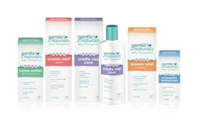
New packaging is now dressed in a more pharmaceutical-appearing white bottle, packaged in a carton of the same color, to present a medicinal image. Color blocking in contemporary colors identifies product variety: Tummy Soother is soft green, Eczema Relief Wash is pink, Eczema Relief Cream is orange, Homeopathic Teething Drops are blue, and Cradle Cap Care is purple.
Efficacy is emphasized through the addition of the copy, “Baby Therapeutics,” along with leaf illustrations incorporated around the logo that suggest the product’s pure and natural benefits.
In place of what Goldstein considered an outdated product symbol—the baby with bear—Gentle Naturals developed a distinctive new emblem, an illustrated baby bracelet spelling “baby.” Goldstein says this design element “provided the final proprietary cue to make mother want to display the product in the nursery, where it will benefit from the word of mouth of visitors.”
Finally, a caduceus, depicted in a soft, dove silver color was added to the package’s front panel to reinforce an ethical appearance. Goldstein says its recessive placement near the bottom of the package was purposeful, “so as not to over-emphasize medical claims.”
As of April, the new Gentle Naturals Baby Therapeutics line was rolling out to retailers nationwide.
