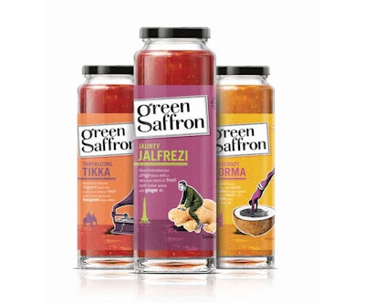
Eccentric Victorian characters artfully etched, a bold color palette inspired by the exotic side of nature, and photorealistic images of spices in their raw form all come together in quirky new package graphics for spice brand Green Saffron, designed to convey the farm-fresh nature of the product and the exuberant, colorful personality of company founder Arun Kapil.
“Arun is the ‘eccentric character’ at the heart of the brand—full of vitality, curiosity, expression, and passion,” says Simon Pendry, creative director for Blue Marlin London, which created the brand identity and visual positioning for Green Saffron. “There is also an eccentric side to the products. Green Saffron’s recipes push culinary innovation, experimenting with new flavors and exploring whole new avenues of taste.”
Cork, Ireland-based Green Saffron markets whole spices straight from the farms of India, along with several sauces and a Christmas range consisting of mulled wine and Christmas pudding. Originally sold at farmer’s markets, the spice brand required a professional package design when it readied itself for launch on Ireland’s retail shelves at the end of 2012.
According to Pendry, the fundamental challenge in developing the brand identity for Green Saffron was “to balance premium with accessibility and to clearly differentiate Green Saffron’s offering from competitor’s non-fresh products.”
Inspiration for the vibrant and whimsical package design came from the idea of “Fresh Alchemy.” As Pendry explains, “The concept of ‘Fresh Alchemy’ helped to anchor and drive the identity development and packaging design. ‘Fresh’ showcases the way Green Saffron spices travel from farms in India to U.K. shelves in a remarkable time of just eight weeks. ‘Alchemy’ depicts the unexpected twists in Arun’s handcrafted recipes, which feature various common ingredients blended into something special.”
Both the resealable foil sachets used for the spices, and the glass sauce jars are stock packages, selected for their practicality and usability, as well as their ability to provide “a neutral canvas to hero the graphics,” says Pendry. The Victorian-era themed etchings used in the package graphics are custom to each spice variety and were created in-house by Blue Marlin London. Packages—with deep, color-drenched backgrounds of eggplant purple, forest green, warm yellow, and deep orange—are printed using six colors or less. Matte laminations, matte varnishes, and uncoated inks are used to give the packs an uncoated feel.
Since the brand launch late last year, Pendry says there has been “astounding positive feedback” from consumers. “Brand loyalists love the quirky and imaginative redesign and feel it truly reflects the work and ethos of Green Saffron. It is clear that Green Saffron are “Spice Specialists’ and not just the ‘curry people.’”