For more than 30 years, passion has powered Nature’s Path, which now considers itself, “North America’s largest certified organic breakfast and snack food company,” with a product line of over 150 cold cereals, granolas, hot oatmeal, waffles, bars, and cookies.
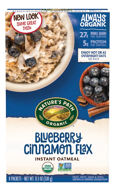
Family-driven and focused on sustainability for the planet, the Richmond, BC, Canada-based firm recognizes that packaging plays a primary role in attracting consumers. To that end, in December 2017 it introduced a bright, bold new look for its organic brands.
“We want our packaging to stand out and reflect how Nature’s Path is different from your standard cereal and breakfast company,” says Arjan Stephens, the company’s Executive VP. “We’re different: We’re independent, family-owned and from day one—over 32 years ago—always organic. We want this message to literally jump off the shelves. Our new packaging is exciting, innovative, and fun.”
The company says bold colors and clean designs “pop” on shelves, making it easier for consumers to spot their favorite products. Nature’s Path uses front-of-pack imagery that focuses on the visual aesthetics of the food, highlighting the deliciousness of the product inside the package. The back of the package features improved product descriptions, tells the story of the company’s origin, and outlines the benefits of choosing Certified Organic and non-GMO products.
Nature’s Path’s mission is not only to sell product, but educate, advocate, and champion organic foods that are better for people and the planet. Throughout the years, the brand has built trust with consumers by being transparent about sourcing and sustainability.
The redesigned packaging “is replacing older versions as items are sold and store shelves are restocked, resulting in a zero-write-off brand refresh, since product with old packaging will not go to waste. According to the company, this is the most sustainable, environmentally friendly option, and supports the company’s mission of always leaving the Earth better than they found it.
As a part of the Nature’s Path brand refresh, the company’s EnviroKidz line is also receiving a redesign. The new EnviroKidz look features brighter, playful packaging and a more integrated logo, which aligns with the new Nature’s Path packaging. The new EnviroKidz design preserves the fan-favorite element on the box—the animal illustrations. The kid-friendly and informative packaging highlights information about the animals, and how consumers support the conservation efforts when they choose EnviroKidz. It also provides parents with important nutrition information on an updated front panel and nutrition panel.
New packaging is currently rolling out to store shelves nationwide.
