Frost-bitten graphics

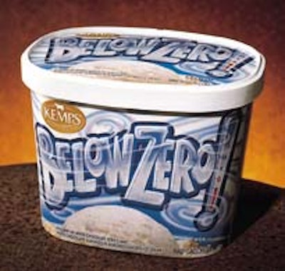
As the official ice cream of the St. Paul, MN, Winter Carnival, Kemps’ Below Zero ice cream needed packaging that would exude chilliness. Compass Design (Minneapolis, MN) used frosty colors like shades of blue, gray and white throughout the packaging.

Pw 19264 S Pw 0400 079

A bone-chilling wind blows across the Below Zero name, which is punctuated by a thermometer registering a freezing temperature. The half-gallon paperboard carton is offset-printed in four colors.

In a hurry? Request more info via Web-based reader service by clicking on the reader service number.

Is your packaging line built for connected packaging?
RFID, QR codes, and 2D barcodes are reshaping CPG operations. See how leading brands are adapting.
Read More
Is your packaging line built for connected packaging?
Need help with your packaging project?
We’ve done the legwork to identify and vet experienced packaging and processing consultants you can contact directly for your next project. Decades of combined experience in packaging line engineering, machinery selection, package and materials development, and food processing operations.
See your advisor options now.
Need help with your packaging project?