After acquiring the 70-year-old Feosol brand of iron supplements in 2010, Meda Consumer Healthcare of Marietta, GA, found itself with a portfolio of products with packaging that had become overloaded with claims and copy, and appeared dated and unfriendly. The supplement line provided a great point of differentiation from its competitors—three varieties formulated for the specific needs of women—but the message had been lost amidst the design's clutter. So Meda embarked on a complete redesign, along with Little Big Brands, “to help make Feosol relevant and consumer-friendly again,” says brand manager Katie Gangell.
According to Little Big's creative director, John Nunziato, Meda was very bold in its approach to the redesign. “It's easy to say you want a brand revolution, and another thing to walk away from almost everything on your current pack,” he says. “I think this is a great example of a fearless client doing the right thing for their brand.”
The first goal was to move away from the “heaviness” of the existing design, Nunziato relates. “It felt too literal, with the heavy red color, logotype, and gold metallic,” he says. “Even more importantly, the communication hierarchy was broken. It was extremely difficult to understand the brand portfolio and individual benefits.”
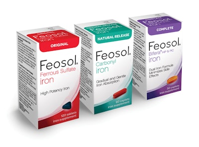
Stripping the brand down to its bare essentials, the new design offers a largely white canvas that lends freshness and modernity to the line. Cartons are spartanly decorated on top and bottom with a block and a swoosh, respectively, of color that provide formula differentiation. With a nod to the hues used on the previous packaging, Little Big chose red for the Original formula and purple for Complete. Green was selected for the Natural Release formula.
A new Feosol logo uses a similar, yet slimmer, cleaner, and more feminine typeface that is prominently embossed on the top of the package, along with the product name and function. Each SKU is also decorated with an embossed illustration of the pill, which anchors the graphics at the bottom of the package. A mix of spot and matte varnish provide depth, dimension, and interest on shelf. All other communications from the previous package were either eliminated or moved to the back or the side of the carton.
Says Nunziato of the final design, which launched in retail stores nationwide in summer 2012, “The new Feosol look is breakthrough in the category. It's feminine without being cliché, and straightforward in a category that is notoriously hard to shop.”—Anne Marie Mohan