Packaging World:
New ways of managing work flow seem to be all the rage these days. What are you seeing or doing in this regard?
Jordan Rettig:
We are looking at digital printing as a way of managing art work changes and the cost that comes with them. Seasonal art or other promotional messaging can be especially problematic, and in such applications digital has considerable advantages in cost. Labels, cartons, even POP are going to digital technologies. And though we haven’t had a lot of seasonal campaigns, as we look at digital we see that it may offer some more cost-effective ways of doing it. Personalized packages sold exclusively over the internet is worth taking a look at, and here is where digital printing really comes into play.
Anything new in packaging materials out there?
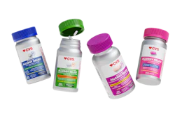
In closures, flip tops and new dispensing options are coming on. So are caps that dispense a powder into a drink, but I have mixed feelings about those from a sustainable packaging standpoint. I guess I’d rather see people carrying little stick packs around in their wallet or purse. Another thing we are seeing are caps that are multimaterial—a design that provides a good grip for the elderly. They’re expensive, and the only one I know doing it is Bayer Aspirin. I’d like to see a cap that would dispense one pill at a time, because we do capsules, tablets, soft gels—a cap that would dispense one of these at a time is something I would like to see. I’m also interested in desiccants that are integrated into the packaging as opposed to being a separate insert like a packet or sachet. It might be a canister built into the cap, or some are exploring ways of incorporating the dessicant into the actual plastic used to make the bottle or cap.
Consumers can be fickle. What are they saying about packaging these days?
They’re looking for simplicity in the packages they encounter. They don’t want to read a complicated set of instructions. Ease of use is what they want. One consumer packaged goods company that understands this is Method. As we go through a label re-fresh we are looking for ways to bring greater simplicity to the look. Less busy graphics on the primary panel and lots more open space, for example. Simple, concise messaging is the idea.