Kate Freestone, the former founder of Rude Health entered the organic cereal realm and launched U.K.-based Freestone’s, her third cereal brand to market. Her love for natural food and nostalgia for growing up in idyllic Somerset, England surrounded by nature’s ingredients inspired her to break into the market.
Slice Design was tasked with creating a clear brand identity and packaging graphics to convey the authenticity of the brand and help it stand out among competitors.
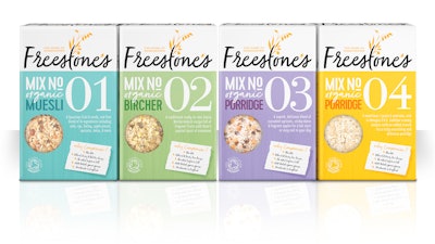
Freestone’s product range consists two mueslis and two porridges with more products in the pipeline for future release. With much debate on how to create differentiating names for the four products, it was decided upon to use a unique numbering and mix system. Freestone’s will launch with Muesli No.1, Birchermüesli No.2, Porridge No.3, and Porridge No.4.
Freestone’s believes healthy eating doesn’t have to come at the expense of great taste, which is the reason the copy, “Why compromise?,” is featured on the package as a sub strap.
Slice Design wanted to create a clear brand identity rooted in the respect for the craft of the product, which is 100% organic, free of sugar, salt, and wheat, and made in small batches with 100% homegrown grains.
The tagline, “The Home of Homegrown,” was created as a reflection of the product being at the heart of something special, delicious, and well nurtured.
A pastel-colored palette was chosen across variants to stand out from competitors on shelf. Batch numbers were incorporated on the front of pack design, allowing the different mixes to be easily identified. The batch number on the package also tells the story of the authenticity of the brand, and notes that all batches are handmade.
Key areas to highlight within the design include the product being 100% certified organic, sourced within the U.K., small batch, and homegrown grains. The Freestone’s logo takes the format of a handwritten script to tie in with the handcrafted qualities and characteristics of the products.
“Slice Design was an absolute pleasure to work with. I cannot thank the team enough. They clearly listened to what the brand meant to me, capturing the true essence of Freestone’s and then translating this clearly onto pack,” says founder Kate Freestone. “At each stage of the design process, they communicated the ideas behind the designs produced and were happy to incorporate any additional feedback with no problems. I’m thrilled with end pack designs, Slices’ can-do attitude was unbelievably refreshing, and how the studio maintains a 'nothing is a problem' mentality is a breath of fresh air! Slice is a perfect working example of teamwork at its best.”