Cheez Doodles, a cheese-flavored snack, debuted in the 1950s, and now Wise Foods is expanding the product’s appeal with new flavors, product innovation, and a complete refresh of its packaging.
“Cheez Doodles has very loyal consumers,” says Jeremy Bjork, Chief Marketing Officer at Wise Foods, Inc. “But the brand needed an update, so we were faced with a difficult challenge: How do you contemporize the brand and accentuate the cheesiness of the product while not alienating current consumers and still keeping the packaging fun? Perspective: Branding stepped up to save the day.”
Perspective: Branding, a San Francisco-based brand packaging design firm, was tapped to refresh the brand across all SKUs and increase shelf impact, while also protecting the brand elements that consumers recognize.
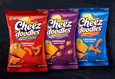
“The brand’s core mixes great taste and fun with a playfully mischievous quality,” says Simon Thorneycroft, founder and Chief Executive Officer, Perspective: Branding. “At the heart of the taste experience is the real, intense cheese flavor, so we decided to elevate the importance, size, and impact of the Cheez Doodles logo and make the Wise logo an endorser of the brand.”
This shift in focus allowed the design team to build a more meaningful story into the brandmark, helping to define its purpose while linking it to the core strengths of the brand.
The existing visual equity of the yellow circle of type previously found in the logo was transformed into the “world of cheddar,” which also injects an element of whimsy, a nod to the brand’s personality. Increasing the scale of the word Cheez versus Doodles also helped emphasize taste appeal in the brand name.
Background colors were changed from candy tones to ones associated with food flavors, and a paint-like texture resembling sprinkled cheese dust adds to the appeal. Real photography of cheddar cheese and the product taken from an overhead angle reinforces the quality taste experience while also parodying how a consumer would view the product at the point of consumption.
The existing line includes 35 SKUs, with three new items introduced with the rebrand: Cheez Doodles Extreme, Cheez Doodles Queso Habanero, and Cheez Doodles Baseballs. Cheez Doodles Extreme is designed as a sub-brand and features the product as a striking match, igniting the taste experience, while Queso Habanero follows the core packaging design system. The brand also partnered with the New York Mets baseball team to introduce Cheez Doodles Baseballs, which will be sold throughout the greater Metro New York market.
“Perspective: Branding hit a homerun with the design,” Bjork says. “It is fresh, clean, and fun. It is true to the brand essence and doesn’t try hard to be something it’s not. These are all qualities that resonated strongly with our target audience.”
The new packaging is currently shipping to both traditional East Coast markets and select national retailers.