Brand managers are acutely aware of the bottom line, so for them the ultimate measure of success is creating a package that generates sales without gumming up operations.
Cincinnati-based Procter & Gamble Co. created just such a package when it introduced to its stable of laundry detergents a cross-promotional package for Tide with Febreze Freshness. The design team cleverly opened up a new area of the package for graphics and branding information, including robust decorative elements, yet the design had no negative impact on the project’s high-speed packaging lines.
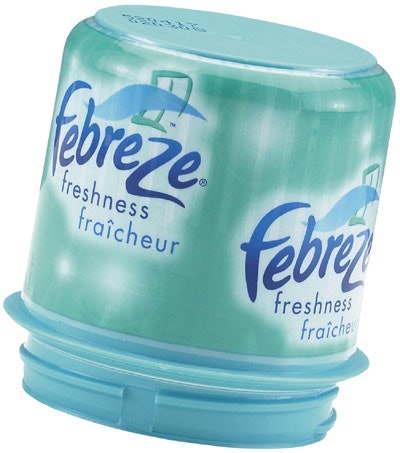
How was this accomplished? By opting for a decorated cap to both attract shoppers’ attention and to help distinguish Tide with Febreze Freshness from other products in the Tide lineup.
Laundry detergent is one category where shelves are cluttered with a mind-boggling choice of brands. Amid all that congestion, consumers welcome packaging that quickly communicates product differences and helps them to select the right detergent.
P&G accomplishes this by extending the branding “real estate” to the cap surface, a previously undecorated area of Tide detergent containers. P&G increased the amount of branding information on the package by decorating the cap with a shrink-sleeve label. Previously, all the branding information was displayed on the in-mold label on the blow-molded, high-definition polyethylene bottle.
The shrink-sleeve label wraps around the polypropylene cap’s entire vertical wall. Label graphics are rotogravure-printed in five colors. The caps themselves are color-coded to indicate the two scent varieties—teal for Meadows & Rain and purple for Spring & Renewal. Matching colors and an icon appear on the bottle label to reinforce the brand’s identity while also indicating the product scent. The decorated caps, working with the primary label on the bottle, help consumers to easily identify the two Tide with Febreze Freshness varieties within the Tide lineup.
The shrink-sleeved cap also demonstrates that outsourcing some packaging operations makes sense in situations in which a product manufacturer lacks the capability to do all the work in-house—even when the manufacturer is a goliath such as P&G, which often packages its own products.
“We’re always trying to find new ways to differentiate our products,” says Michael Fox, packaging engineer at P&G. “But we didn’t really have experience with running either a shrink-sleeve label or an in-mold label ourselves, and shrink sleeve seemed like it could get us in the stores a little faster.”
Rather than purchasing additional equipment and taking on the additional burden of managing the operation itself, P&G outsourced the entire packaging project to Multi-Color Corp. and its contract packaging subsidiary, Quick Pak.
Fox says the complexities of properly attaching a shrink sleeve to the cap made outsourcing the project a sensible decision. First, the sleeve must be vertically aligned on the cap. Second, the sleeve must be attached with the right adhesive—in this case, it is a proprietary adhesive—in order to keep the label snugly in place on the cap as the cap is applied to the bottle. Finally, the sleeve has to stay firmly in place on the cap each time the package is handled in the store and then each time the consumer opens and closes the cap during home use.
“P&G asked us, ‘Can you put a robust label on our cap that can withstand the filling and capping process and still look good on the shelf?’” says Francene Lord, director of sales at Quick Pak.
P&G delivers the caps to Quick Pak, which applies the sleeve labels produced and printed by Multi-Color. The decorated caps then go to P&G filling plants in Lima, OH, and Alexandria, LA, where they are placed on the detergent bottles.
A key determination early on was that the caps needed to be predecorated with the sleeves because bottle-filling lines at the two P&G plants that produce Tide with Febreze Freshness lacked shrink-sleeve application capability. The predecorated caps needed to survive both the cap-conveying system and the torque applied in securing the caps on the bottles after P&G filled the bottles on its own lines.
Multi-Color’s Product Leadership Group conducted line trials and determined that predecorated caps would be possible if a specially designed PETG shrink-sleeve label were used, one that Multi-Color could produce efficiently.
Besides the issue of predecorated caps, another challenge was the project’s accelerated timeline. P&G planned to launch Tide with Febreze Freshness in August 2005 and its production schedule required that materials be available to begin production in June.
“We met with Procter & Gamble in late January 2005 and presented our plan for the project,” says John Voelker, Multi-Color vice president of sales. “We offered to handle everything in-house—product development, prepress, production, and the actual decorating. Being able to handle the entire project made a big difference.”
The Product Leadership group oversaw product development and provided technical support. Laser Graphic Systems, Multi-Color’s prepress facility in Erlanger, KY, produced the color separations and printing cylinders. Multi-Color’s Scottsburg, IN, facility prints and finishes the shrink sleeves.
Lord explains that Quick Pak’s close proximity to P&G’s bottle-filling plant in Ohio that produces Tide with Febreze Freshness was a key advantage in meeting P&G’s tight launch requirements. “This worked because of logistics, in part. Our contract facility is within two hours of P&G’s filling facilities,” Lord says.