If you’re not familiar with Memphis Design by name, you’d likely recognize it by sight. Featuring bold, graphic patterns and retro, clashing color palettes with plenty of neon hues, the ’80s design aesthetic is hard to miss.
Design styles are often an indication of, or a reaction to, the times we’re living in; Memphis Design is the perfect example of this—both when it first came onto the scene and now.
The 1960s and 1970s were heavily influenced by modern minimalism, which played by the rule “less is more,” encouraging clean lines and neutral tones. Tired of this lack of excitement in design, a group of architects and industrial designers in Milan, Italy, responded by doing the exact opposite. Calling themselves the Memphis Group, they rebelled against the wave of understated design with a style centered around vibrant colors and a jumble of geometric shapes, stripes, and bold patterns. Initially coming to life in the form of furniture, the trend soon expanded to art, design, fashion, and popular culture.
 | Watch this video on five emerging trends in e-commerce packaging design. |
As we’ve all spent much of the last 18 months stuck within the four walls of our homes, it’s no surprise we’re seeing a collective yearning for more excitement in design and beyond. Brands are once again embracing more artful trends for their packaging that not only show off their personalities, but also brighten up their customers’ days too.
Memphis Design’s loud presence may be polarizing, especially when not approached in the right way, but many brands are finding impressive ways to put their own spin on the trend and expertly walk the line between fashionably retro and dated.
Here are six brands doing a great job of bringing back Memphis Design in a modern way, one package at a time.
1. Who Gives a Crap
 The bright colors and mix of patterns used for WGAC’s packaging are eye-catching, fun, and inviting and match the energy of the brand. Image credit: Who Gives a Crap
While WGAC’s intentions are obviously very serious, its brand personality is anything but (does toilet humor ever get old?), and it has adapted Memphis Design to epitomize this in its packaging.
Using bright colors and a mix of patterns consisting of lines, circles, and geometric shapes, it’s eye-catching, fun, inviting, and, most importantly, matches the energy of the brand. Plus, all these elements create the perfect backdrop for its logo to really stand out.
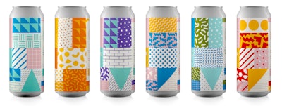
2. Temescal Brewing
 From its glassware to its beer cans, Oakland, Calif.-based Temescal Brewing plays with multiple elements of Memphis design across all its brand assets.
Temescal’s aesthetic is ultimately a perfect example of how versatile Memphis Design can be, even within one brand. Depending on the feel they want to evoke for each product, they adapt the style accordingly. The brand prides itself on being fresh and welcoming, and they cleverly use Memphis Design to send that message.
3. Doritos
 From the flashy, geometric shapes and lines to the neon colors, the design for Doritos limited-edition tangy pickle flavor gives off the intensity Memphis Design is known for. Image credit: Doritos
From the flashy, geometric shapes and lines to the neon colors, the design is unquestionably in your face, giving off the intensity Memphis Design is known for. While this packaging design would likely be a bit over the top for many, in this case, it’s a perfect representation of the intense flavor of the chips inside—stimulating the senses just as much as the taste!
4. Halo Top Ice Cream
 Halo Top’s clever use of miniature shapes and lines encompass the Memphis feel without clashing with the essence of the brand. Image credit: Halo Top
While a bit on the more subtle side, the brand’s minimalistic use of Memphis Design aims to evoke the same pleasure and joy that comes with eating a whole pint of ice cream in one sitting. Just by looking at the variety of colors, shapes, and strokes used cleverly for each flavor, you have an idea of what the product will taste like. It feels a bit extravagant without being overly so, and this clever use of miniature shapes and lines encompass the Memphis feel without clashing with the essence of the brand.
5. Calexo
 Calexo’s packaging is full of vibrant colors and graphic geometric patterns reminiscent of the fresh nature of the Memphis aesthetic. Image credit: Calexo
Memphis design can (intentionally) feel quite spontaneous and chaotic and can sometimes look out of place randomly applied to a packaging design. However, by embracing it across all touchpoints of its brand, Calexo maintains brand consistency and recognizability—which are vital attributes for building trust and long-lasting connections with customers.
6. Mighty Gum
 Mighty Gum’s packaging shakes things up with a softer take on classic Memphis Design.
This is a great example of reworking a trend to best suit your brand ethos and better appeal to your target audience. The way in which Mighty Gum has applied Memphis Design helps the brand differentiate itself from other gums on the market, without distancing itself from its ideal customers. And following the crowd was never what Memphis was about anyway!
 | Read article, "5 New Beverage Packaging Designs Celebrate Summer." |
There’s a common theme that all these brands share, and that’s the desire to be known for doing things a little differently. If you’re also looking to help your products stand out from the crowd, then Memphis may be the design style for you. But, as is the case with any packaging design, whatever you choose should be reflective of your personality, values, and goals as a brand. Feel free to make Memphis entirely your own—after all, the style itself was born out of breaking the rules!
Tristan Le Breton is Creative Director of 99designs by Vistaprint.