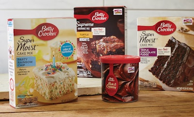
Trading in her slick, plastic spoon for one with a warm wood grain, Betty Crocker has updated her look to appeal to a new generation of homemakers: marketing-savvy Millennials with an appreciation for classic values and authenticity. The package redesign, which encompasses 70 SKUs, had at its heart the goal of reaching the modern mom, while at the same time differentiating the product on shelf and increasing the brand’s shopability system.
“There were several factors pointing to the need for a category redesign, but the connecting thread that bound them all together was Brand Purpose,” explains Eric Staples, Senior Creative Strategist for Bluedog Design, LLC, which crafted the new packaging graphics. “We had just come out of a rich and robust journey with the cross-functional brand team of rediscovering and recapturing Betty’s Purpose: to help make home. It was inarguably what Betty had done best when she was at her best. But, as General Mills CMO Mark Addicks has said, the brand had fallen off track a bit over time, and that core purpose needed to be reinvigorated in order to bring renewed relevance to a new generation of ‘home-makers.’”
As part of this objective, Bluedog was tasked with overcoming what Staples calls the baking category’s “sea of sameness,” which over time had led to widespread commoditization and therefore, widespread discounting. “The aisle’s mantra, as it were, was often ruefully referred to as ‘ten for ten’: ten boxes of cake mixes for ten dollars,” he says. “Not exactly the kind of pricing strategy that gets brand managers excited.”
Another goal was to reimagine the brand’s shopability to more closely align with the way consumers actually shop the category. Dominating Betty Crocker’s packaging was a strong, singular system employed for every product in the baking portfolio. Says Staples, “The question was, ‘Should cakes and brownies and cookies and muffins all follow the same exact design formula?’”
Making home through design
The most recognizable symbol of the Betty Crocker brand, The Betty Crocker Red Spoon, has been a staple of the brand’s packaging since 1954. Although the spoon has gone through several slight modifications over the years, its recent rebirth in wood grain was a major step for General Mills, signaling its intent to appeal to more modern baking aspirations.
“One of the first implications we realized coming out of the Brand Purpose work was that the spirit of ‘making home’ in a modern context probably wasn’t best captured in a shiny plastic spoon—particularly for a generation well-known for its admiration of classic values and ways of living, as well as a strong desire, one might even say demand, for authenticity. And so we evolved the logo for the first time in decades,” says Staples.
Connecting with the modern mom’s lifestyle—rooted in the real, rather than in the ideal—the new design disposed of the category norm of perfectly staged layer cakes floating on ambiguous color fields and replaced them with real, doable desserts, with imperfect edges and all, in real kitchen contexts, “even down to the lighting,” says Staples. While the overall architecture and hierarchy were kept the same to ensure consumers could quickly find critical product information, shopability was improved with different contexts for different product categories. For example, cake mixes use bright, sun-drenched kitchen backgrounds, while the graphics for brownie mixes depict stacks of decadent brownies on a dark wood table.
To further enhance the “making home” strategy, new fonts were also chosen that were more friendly, personal, and approachable.
After a soft launch, the new Betty Crocker packaging was recently rolled out to stores nationwide; however, it’s still too early to gauge market response. “But the fact that a design shift of such scope made it to market at all is a success in and of itself,” Staples says. “Anecdotal reports thus far are pretty positive. Beyond that, well, we’ll probably have to let it cook a bit longer, if you’ll pardon the pun.”