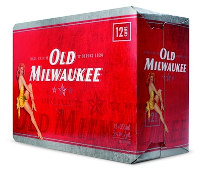
The iconic Varga Girls of the 1940s and ’50s have re-emerged in all their playful, voluptuous beauty on new package designs for Sleeman Brewing and Malting’s Old Milwaukee beer brand in Canada. Launched in spring 2011, the designs use retro pinup-girl illustrations to add some panache to the value brand, while emphasizing its historical relevance.
First brewed in 1890, Old Milwaukee was reintroduced in 1955 as a value-priced beer by the Joseph Schlitz Brewing Co. In 1982, Schlitz and the Old Milwaukee brand were acquired by Stroh Brewery Co. of Detroit. In 1999, Ontario-based Sleeman brought the brand to Canada, when it acquired the rights to all of Stroh USA’s value-brand beers.
In 2010, Sleeman set about updating packaging for Old Milwaukee with brand design firm Dossier Creative to capitalize on the steady growth in Canada of value-priced beers and to position it against the biggest mainstream beer brand in the market. “This redesign was really to position Old Milwaukee very firmly against Budweiser,” explains Bryce Zurowski, partner and COO of Dossier, who at the time of the redesign was western regional vice president of Sleeman. “The redesign was intended to show consumers that a branded value beer can be number one, taste great, and have a more contemporized image without the big-budget TV media dollars that Budweiser boasts.”
Launched on a staggered basis to the Canadian provinces beginning in spring 2011, the pinup-girl packaging was an instant hit, resulting in brand growth of up to 40% to 50% in some markets by summer 2011.
Consistency across the provinces
One complementary aim of the Old Milwaukee package redesign was to bring consistency to a brand that donned different package graphics depending upon the market in which it was sold. This, Zurowski explains, was the result of the corporate structure at the time of Sleeman’s purchase of the brand and the nature of Canadian beer markets. “Sleeman was a young company, and the brand was managed independently,” he says. “In Canada, each province is really a unique beer market. Consumers are very different, the brand assortment is very different, pricing is very different, and oftentimes, brands can have different identities or positions.”
Bringing the whole portfolio together under one, consistent brand design provided both marketing and operational benefits, Zurowski relates. From a marketing standpoint, it allows Sleeman to run national brand campaigns “projecting the Old Milwaukee brand with a stronger, clearer message across the country,” he says. Operationally, the redesign simplified the complexity of the number of SKUs in the portfolio from more than 80 to approximately 50.
But, because of the diverse nature of Canadian beer markets, there was also a risk with a wholesale packaging change that the new graphics may not appeal to some markets. “It’s always a concern with any rebrand when you are trying to appeal to more of a mass market that you may lose the intricacies,” says Zurowski. As an example, he cites the Ontario market, where the Liquor Control Board is responsible for all the beer purchases in that province. “And for them to put packaging that was perceived as a little bit more risqué or irreverent on the shelf was in doubt,” he says.
Another concern related the impact the redesign might have on the traditional, “blue-collar” Old Milwaukee drinker. “The consumer groups skewed a little bit older, so there was a concern that by positioning this brand at a slightly younger audience and targeting more of the mainstream drinker we would risk alienating a lot of the older drinkers who had led to the brand growth in the market in the past,” says Zurowski.
Considerable consumer research, and qualitative and quantitative testing of new package designs ultimately determined however that the redesign was worth the risk, given the opportunities for growth by appealing to a younger audience.
Linking to the past
The choice of the retro pinup girls as the main graphics for the new package design signaled both a re-invention of the brand, as well as a link to Old Milwaukee’s historic past. “The biggest message we wanted to send was that Old Milwaukee is not just a brand for your father,” says Zurowski. “We wanted to showcase that this is a contemporary brand that can be credibly drank by a younger consumer, even down to the legal drinking age.”
At the same time, the Varga-style girls link the brand to the time when Old Milwaukee was a leading brand in North America and leverage the brand’s long history. “There’s an authenticity to a brand that can speak credibly about a history that goes back that far,” says Zurowski. He adds that the increasing use of vintage design elements by Sleeman and others signals a shift in brand marketing from an era of bought media to one of earned media, where brands doing unique things are being talked about in the blogosphere and the twittersphere. “Awareness of these brands is not necessarily rooted in a lot of money spent on advertising, but rather more in credible brand stories rooted in either unique ownership or history,” he adds.
In selecting the pinup girls for the packaging—different girls are used for Original, Dry, and Light beer varieties—it was first important that they represent the era and second that they depict attractive women. “It was important for us not to look like what I would call modern-day beer advertising,” says Zurowski, “which features women on the beach.” Sleeman went with illustrations rather than photography, making the pinups more illustrative than real. The girls’ attire was also designed to be representative of the era.
Zurowski adds that Dossier is continuing to develop new pinup girls for the Old Milwaukee brand that can be used for holiday-themed packaging and seasonal versions, “to keep the brand fresh.”
In terms of the packaging’s primary colors—red for original, blue for Dry and Light—and fonts, Dossier retained the previous look and feel of the existing packaging, keeping the identity simple and clean. “It’s been more contemporized, the color choices are a little brighter, and it’s a little more vibrant,” says Zurowski, “but the consumer didn’t struggle to find their new Old Milwaukee on-shelf, which was very important to us.”
Technical challenges
The new design was rolled out across all of Old Milwaukee’s package formats, including can wraps and trays, bottle cartons and shippers, and cans and bottles, in three sizes each. Creative development and production company Rayment & Collins was instrumental in adapting the designs to each of the package formats for a range of printing processes, depending on the package type. While paper and cans are printed using litho-print processes, the 24-pack bottle carton is done using flexography.
Explains Rayment & Collins vice president of operations Ross Benns, “Unique files were created for each process, with the art elements (e.g., background, girl images, watermark) receiving special treatment.”
Benns adds that the biggest challenge of the project was the accurate reproduction of the girl images on the cans. “The cans are produced at a very high rate of speed and with great variability,” he says. “We created files that we thought would achieve the desired results and did a pilot run.” The pilot run pointed out the need for additional adjustments, which were done without a second pilot, due to budget restrictions. “We had to trust that the decisions we made would turn out to be correct,” Benn notes. “In the end, they were.”
Measurable results
With the launch of the new packaging for Old Milwaukee, the value brand began a positive growth trend against big beer brands like Budweiser, despite not having the big advertising bucks of these mainstream brands.
In Ontario and Quebec, where the brand sales were flat or slightly declining, sales rose almost immediately by 10% to 15%. In the Western provinces, where the brand was already exhibiting a 25% growth, the new packaging increased that number.
“The sales group at Sleeman conducted an excellent launch to put the brand in high-traffic locations with major retailers,” says Zurowski. “It really helped to leverage that redesign because it was not supported with any above-the-line media, any television. It was a true in-trade launch, and it had a real impact on the business.”