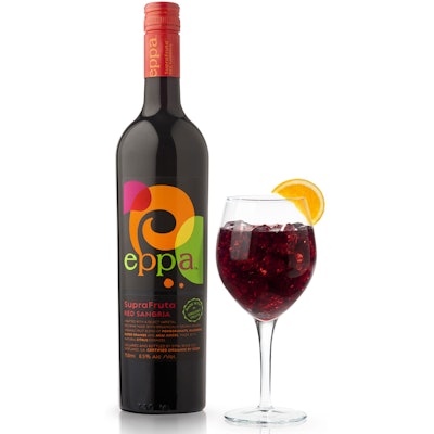
Neon-like splashes of color in an organic design bring a celebratory air to packaging for a new wine brand from The Eppa Wine Company, Coral Gables, FL. New Eppa SuperFruit Sangria in Red and White varieties is a mix of high-quality ingredients, including Mendocino County Cabernet Sauvignon and Syrah wines made from organically grown grapes and a juice blend of organic pomegranate, acai, blueberry, and blood orange.
In March 2010, Spring Design Partners was selected to define the brand name, position the product, and create the visual presentation for Eppa SuperFruit Sangria. Says Spring Design president and executive creative director Ron Wong, “Our strategy was to leverage color and shape to communicate the key consumer benefits: celebration and living well.”
Packaging is a stock, green, 750-mL glass wine bottle from Vitro Glass Company, decorated with a pressure-sensitive label six color-printed with brilliant splashes of color by Spear, Inc. “We chose vibrant, luscious colors to telegraph amazing taste and then put those colors in festive, overlapping organic shapes that seem to dance around the bottle,” says Wong. “The resulting design telegraphs the feeling of entertaining and having a great time with friends.”
Complementary colors are also used for the lowercase Eppa logotype and for front-panel product copy. Bottles are topped with red and green shrink labels for Red and White varieties, respectively.
After a lengthy organic certification process, Eppa SuperFruit Red Sangria was launched in Florida in August. Broad distribution is expected in September. Says Eppa managing partner John Gomez, “Consumers are consistently impressed with the packaging and the taste. They see the packaging as captivating and communicative of a contemporary and high-quality product that suggests fun and style. The colors and graphics also signal fruit, freshness, and vibrancy. It really pops off the shelf relative to the competitive wine set.”