Eating healthy doesn’t have to be about “sad snacking.” That’s according to Angela Spindler, founder and Creative Director of Australian firm Depot Creative, which last year created playful, vibrant, and bold branding and packaging for the new Hopapops line of popped lotus seeds. The new-to-the-U.S.-market plant-based product from WaterFox Foods Inc. of Springfield, MO, is similar to popcorn in size and taste, but is packed with vitamins, minerals, and antioxidants.
WaterFox was established in 2018 by food industry entrepreneurs who saw an opportunity within the growing healthy snack market to bring a long-time staple of the Indian and Asian diet—the seed of the lotus flower—to a new market. In doing so, they wanted to create a brand that expressed their nutritional credentials and epitomized the fun side of healthy snacking. “They wanted to deliver a product bursting with flavor in a new and exciting way to all those seeking a tasty, healthy alternative,” says Spindler.
The first job for Depot Creative was to come up with a name that would create excitement and interest around the product—“a name that alluded to its process and expressed its benefits but was also abstract, giving it a freshness and individuality,” explains Spindler. “With that, Hopapops came about. We captured the energy and protein boost—snacking to put a spring in your step. Combined with the process—the seeds are gently roasted until they pop.”
Graphics for the Hopapops snack pouch were informed by previous research done by Depot Creative that showed that, as the healthy snack category has grown, product options have become more confusing to consumers due to unclear messaging or unstructured pack architectures. Or, quite simply, Spindler says, the packages have little to no visual appeal.
With Hopapops, because lotus seed are relatively unknown in the U.S. market, Depot Creative felt it was imperative to give the consumer a good understanding of what the snack is and be able to convey that at a glance. “We wanted the consumer to view the packaging and feel like they were diving right into an open bag of this stuff, seeing the puffs, understanding the shape and the texture, getting a huge whiff of flavor, and anticipating the big crunch, all while knowing it ticks the healthy boxes and does not aggravate certain food intolerances,” says Spindler.
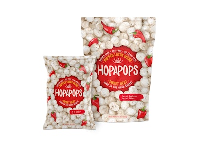
The focal point of the design is a colored circle in the middle of the bag’s front panel that houses the brand mark, the flavor descriptor, copy on the product’s health benefits, and a subtle illustration of a lily pad. A different-color circle is used for each of the five Hopapops varieties: yellow for White Cheddar, red for Sweet Heat, pink for Himalayan Sea Salt & Pepper, orange for Mango Habanero, and brown for Coconut. Lower on the bag, a coordinating swipe of color holds information on the fiber and protein content of the product.
The brand mark, which remains consistent in color and placement across the product line, has an uneven typography that Spindler says gives it “a bit of cheeky bounce, a dynamic.” She adds that the hand-drawn style is both contemporary and legible, and because of the overall shape and condensed nature of the letters, consumers are able to easily get through the long brand name.
Covering the body of the packaging is a hyper-realistic illustration of the popped lotus seed snack, a design chosen for two reasons: one, to convey the filling nature of the nutritionally-dense product, and two, to put the product on display. “We wanted to move away from the tidy cameo of ingredients that many snack brands use, or no image, and honestly reveal what’s inside,” Spindler explains.
Peeking through the popped snacks are partial images of ingredients for each variety—for example, the tips of red habanero peppers and partial views of sliced mangos for Mango Habanero. Says Spindler, having just pieces of the ingredients poking out “alludes to ‘seasoning perfection’ rather than ‘saturated, in need of a glass of water, flavoring.’” Use of the ingredients also gives clarity around flavor differences, as well as plenty of appetite appeal.
Hopapops—in a 1-oz pouch for portion control and a 3-oz size for sharing—were unveiled in September 2018 at the Natural Products Expo East show and were met with “great support and interest,” Spindler relates. “The client’s feedback was, ‘Can’t even count the number of people who stated we nailed it—packaging, name, colors, and branding.’” Currently, the snacks are available through Amazon.com.