With its expertise in fruit juice sourcing, blending, and filling, Tropicana Brands Group was plenty confident that it could deliver an all-new range of healthy and delicious Tropicana Kids Smoothies. But the brand owner also realized it would have a two-pronged brand design task ahead of it when it came to competing, both in the retail refrigerator case and in the refrigerator at home, with existing kids’ smoothie players Innocent and Happy Monkey.
The suite of packaging—paperboard carton multipacks containing Tetra Pak’s Tetra Wedge format juice pouches—would be the canvas on which these designs and branding would have to do some heavy lifting. Step one would be to make sure the carton to appealed to the parents selecting the product among competitors on a retail shelf. Step two would be to use the wedge-shaped pouch to appeal to the kids consuming the bright, fun, but stealthily healthy drinks.
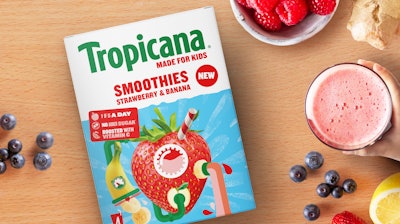
Tropicana tasked its long-time strategic brand-design collaborator Stormbrands with developing a fun, reassuring, and distinctive brand and packaging identity for the Kids Smoothies launch. To succeed in a hot market, the resulting design system had to address key motivators for both parents and kids. For parents, that required providing information and cues about the quality of the ingredients, as well as nutritional and sustainability factors. For children, it was all about cool, engaging design with fun-fact elements on the back, reminiscent of the back of a cereal box. The Smoothie Machine on-pack graphic design concept bubbled up from the Stormbrands team's own kids, who were asked to draw how they believed smoothies were made. The automated machine element balances with Tropicana's usual real, natural fruit graphic treatment.
“We’ve created a brand architecture and packaging system that’s strongly aligned to Tropicana’s iconic core identity, which is synonymous with quality, taste, and natural fruit,” says Zoe Phillipson, creative director, Stormbrands. “But we’ve also developed a new system with appeal and credibility as a parent-purchased but child-focused range. It accommodates the needs of both perfectly… There were three stages. First, it’s a known and trusted brand in Tropicana, so how do we get that reassurance across? Second, we had to communicate that it's for kids, then had to appeal to them. And third, because Tropicana is so well known for juices, we had to communicate that that the product’s a smoothie.”
Balancing fun with integrity was strategic for designers. The concept couldn’t be too playful without risking some of the positive associations for parents, who would be ultimately making the purchasing decisions. To achieve this, beneficial credentials in a disruptor, reading ‘1 of 5 a day’ [referring to one of five servings of fruits and vegetables], ‘No added sugar’, and ‘Boosted with Vitamin C,’ feature on the carton multipack. This messaging only appears on the secondary packaging, designed for parent’s in store, not the primary package with which kids interact—an example of the stealth health approach. Also, real-fruit graphics gesture toward naturalness. The smoothies involve a blend of natural ingredients, and very little processing ensures all the nutrients remain intact to optimize healthfulness.
But the child is the consumer experiencing the “brand in the hand,” the Tetra Pak wedge primary package. Here’s where design can help kids wield their so-called “pester power,” in enjoying a product so much that they ask for it by name. Benefits from personality-led messaging and fun information, like “mandarins can get sunburn” and “a pineapple is actually a berry,” which engage kids and create all-important school lunch table talking points.
“Whereas a lot of pester power products—you think of the old school breakfast cereals like Cocoa Pops, with chocolate and monkeys—they're very much speaking to indulgence, rather than goodness,” Phillipson says. The back of the pack contains fun fruit facts, reminiscent of a cereal box that kids can engage with at the breakfast table, the lunch table with class mates, or on a soccer field with team mates.
Though the cartons are designed to appeal to parents and the wedges to kids, both share the same design hierarchy of a white upper half with familiar, masterbrand cues and a clear declaration that the product is a smoothie, not a juice. That’s because on-shelf in a low-down chiller or even in the fridge at home, the lower half of the carton or wedge is often obscured. The goal was to get parents to first see the trusted brand and product type.
“Then when it comes to the wedge inside, we were wondering if we could put the branding at the bottom, but what we felt that this really needed was consistency,” she says. “So we opted to keep the branding at the top just so that we could keep clear that is Tropicana.”
Even so, this practical parental appeal on the top half of the packs is again balanced with a more whimsical, child-friendly design visual that’s they call the Smoothie Machine concept.
“We spoke to our own team’s kids and got them to draw pictures of how they thought a smoothie is made,” Phillipson says. “One came back with the concept of a fruit machine, and we thought, ‘this is absolutely brilliant.’ It’s kind of a Willy Wonka-esque fantastical world of curiosity. From there, we essentially designed a fruit machine graphic that suggests how a smoothie might be made. We use the real fruit graphic style that Tropicana is known for, but we’re also building in that sense of fun that sense of sort of energy spontaneity.”
The design on the back of the primary package is entirely kids’ territory, save for the nutrition label, carrying fun facts about the fruit used in smoothies.
“We did play around here with whether it could be a little bit more joke oriented. Like, we used to get jokes on the back of a Penguin Bar,” she says. “We opted for the fun facts about the fruit itself because it felt more like Tropicana, since it's more about the fruit that they choose to go into their smoothies.”
Tropicana was also keen to expand the imagined dayparts or consumption occasions associated with the smoothie product, progressing from breakfast stalwart to all-day hero, both in and out of the home. Tropicana Kids Smoothies are designed to slot into packed lunches straight from the fridge, an easy way to look after youngsters’ health when they’re away for the day.
“Parents like to choose products that are naturally healthy from brands with trusted reputations,” Phillipson says. “Kids want brand experiences that are fun, exciting and make them look cool in front of their friends. Stormbrands has satisfied both audiences with a distinctive identity. The results catch mom or Dad’s eye in the supermarket and provide showing-off creds for the kids.”
Tropicana Kids Smoothies cartons and metalized film pouches were flexographically printed in CMYK plus Pantone 348 for the Tropicana logo. They arrived at major supermarkets on Sept. 25, where they are sold as four-count 150-mL multipacks of wedges in Pineapple & Mango and Strawberry & Banana varieties. PW