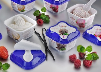
Thanks to In-Mould Labeling by package supplier RPC Superfos, it is possible to show the texture of the ice cream in razor-sharp photo quality on the injection-molded polypropylene package. This is complemented by the striking blue colour of the lid that catches the consumer’s attention. Overall this smart look of the EasySnackingTMcontainer makes the product stand out on shelf.
In addition to these powerful colours and smooth design lines, the integral spoon ofthe handy packageis a keyfeature for Taice. The spoon is neatly separated from the ice cream, and easy to grasp under a tear-off label in the lid.Taice made the vital packaging decision in collaboration with Denis Komarov, the company representative at UnipakCentr.
“The Taice ice cream is of excellent quality so it was important to find a packaging solution on a matching quality level,” he explains. “In the EasySnackingTMpot, we found what we were looking for. We value the entire packaging solution, but the spoon deserves a special mention. It is sturdy, convenient and perfectly in tune with consumer demand for an easy sweet treat.”
A new player in the Russian ice-cream market, Taice sells its product through food markets, cinemas, pizzerias, and gas stations.