Thick, black, swooshing brush strokes, like the precise movements of a samurai sword, the iconic outline of a samurai warrior’s helmet, and a bold, contemporary Japanese style are all design elements of the packaging for a new imported sake brand developed to bring approachability to a spirits category not well understood in the U.S. Hiro brand sake was introduced in spring 2011 by three spirits industry veterans who were inspired by their love of sake and saw an opportunity to create an authentic, premium brand that consumers could ask for by name.
Says Hiro Sake LLC co-founder, CEO, and president Carlos Arana, who has worked with brands such as Jose Cuervo, Seagrams, and Jim Beam, “From long experience in the spirits industry, my partners and I know that consumers like brands, not categories. So they don’t go and ask for a vodka; they ask for a specific brand. The same with tequila, the same with rum, the same with whiskey. So it was a little bit of an eye-opener for us to realize that with sake, consumers were not asking for a brand. That’s where we really saw an opportunity.
“Japanese restaurants and Japanese food are becoming more popular, so people are beginning to learn about and consume more sake, but they don’t know how to order it; the names are unpronounceable. So we thought, let’s go for it, let’s develop a brand.”
After coming up with a catchy, easy-to-remember brand name, Hiro Sake looked to New York City design business Monday Collective to translate its strategy into a package design that would be “modern, authentic, and eye-catching,” says Arana. Using a unique design approach, Monday Collective created simple, distinctive brand imagery that both differentiates the brand in the crowded spirits category and connects with the international spirits consumer.
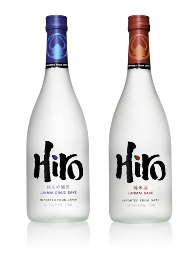
Hiro sake is packaged in a stock, 720-mL glass bottle with a frosted, translucent white surface. Hot and cold varieties are differentiated by artful touches of color: Red is used for Junmai Sake, or Hiro Red hot sake; blue is used for Junmai Ginjo Sake, or Hiro Blue cold sake. Says Arana, “Monday Collective did an incredible job. I get to see it every day when I introduce the brand to new outlets, to consumers, and to wholesalers. The first thing they say is how much they love the package; it’s wonderful, really wonderful.”
Curating expertise
A relatively new firm, Monday Collective was established in September 2010 by designers Rochelle Martyn and Lisa Simpson to “challenge the epidemic of mediocrity in brand design with more disruptive thinking,” explains Martyn. “Not disruption for the sake of it,” she adds, “but disruption that connects with people in a way that’s valued.”
While the “Monday” portion of the agency’s name refers to the theme-based field trips and excursions Martin and Simpson take on Mondays to gather design inspiration, the “Collective” part of their name refers to the diverse teams of outside experts they assemble for each specific project.
“Traditional agency models, using the same teams and linear processes, don’t feel very entrepreneurial and are not nimble enough to swiftly adapt to today’s forever-changing world,” says Martyn. “Monday Collective is a fluid, rotating collective of creative experts that grows and moves organically to stay truly connected. We constantly observe, explore, discover, and debate what’s going on ‘out there’ so that we can identify design ideas that challenge conventional thinking and connect with people and their lifestyles.”
Acting as design strategist and curator, Martyn organizes teams depending on the design vision of each project and the right expertise needed to help reach that vision. “The core expertise includes insight seekers, visionary strategists, provocative designers, specialist artists, and production perfectionists,” she explains.
For Hiro, Monday Collective selected a Japanese designer, Hiromi Tatsuta, to help the team gather visual inspiration, icons and symbols, and colors from Japanese culture to assist in the design thinking. Tatsuta was also involved along the way as design ideas were created, validating whether they felt authentically Japanese. Monday field trips included visits to local Japanese restaurants, bars, and retailers, “to taste and to observe, to see how the other sake brands look on the back bar, to see what happens with the lighting, to understand what the design needed to achieve in terms of the environment it has to fit into, and to observe the visual language,” Martyn says.
What Monday Collective determined was that the spirits category is an overcrowded one, with an abundance of new and traditional, local and international brands. When it comes to sake, they observed, consumers are confused not only about how to pronounce the Japanese brand names, but also about how to serve the product. “There isn’t anyone telling an interesting story around sake,” Martyn says, “or anyone with a brand design that’s simple and distinctive.”
From these insights, the collective came up with a design strategy around bold, authentic typography. To create the brand logo—the main graphic element on the front of the glass bottle—Tatsuta introduced the collective to an expert in traditional Japanese calligraphy living in Japan, who hand-drew the Hiro logotype. “It was important to have the Hiro logo drawn by a Japanese hand, not a computer, using the traditional brush and ink to add the detailing that wouldn’t have been achieved otherwise,” says Martyn.
Samurai central in story
Another central element of the brand that Monday Collective tried to capture in the package design was the origin of its name. Hiro was inspired by the true story of Hiroemon Takeda, a renowned Samurai and Japanese Sake connoisseur of more than 200 years ago who aspired to create a Japanese sake recipe that would be received as a work of art and would serve as his legacy for all time. Working together with the most skilled master brewer, or Toji, Takeda was said to have combined the finest rice grown in his own fields with artesian water to produce a truly exceptional Japanese sake recipe. According to Hiro Sake, it adheres to the same exacting standards of sake brewing as its namesake, with the brand produced in the Japanese city of Murakami, in the Niigata Prefecture, using specially polished rice.
Package design elements that speak to Takeda’s influence include a circular brand icon on the neck of the bottle that represents a samurai warrior’s helmet. The icon, says Martyn, was inspired by traditional Japanese crests, which are often circular in shape and have illustrations within them depicting a story. On the back of the bottle, a stylized illustration of a samurai brandishing two swords accompanies the story of Hiroemon Takeda.
“The design idea focused on communicating an authentic, Japanese story, and the precision and movement of the samurai warrior in action,” says Martyn. “The design expression is quite opposite to the traditional, restrained designs of many premium spirits.”
The lead designer for the project was co-founder Lisa Simpson, who Martyn says gathered inspiration, developed the ideas and design, directed the Japanese designers, and ensured the design was “realized to perfection.”
Building a following
In May 2010, Hiro sake was strategically unveiled in select on- and off-premise locations in New York City—a place where, Arana was quoted in a Wine & Spirits Daily article as saying, “trends are made.” The product also has been launched in some New Jersey outlets. Maine is the next target, followed by Miami, and then Los Angeles.
Thus far, Hiro Sake’s slow-and-steady distribution strategy is going according to plan, Arana says, as the company tests the concept. Early results are encouraging, however. “We’re thrilled that people love the packaging, love the product, it’s fun, it tastes beautiful straight, or you can create mixed drinks,” Arana says.
In fact, there is another benefit of the simple, catchy brand name that only a marketer could have foreseen: Bartenders love to play with the name to create cocktails, such as the Super Hiro and the Hiro Sunrise. “The name lends itself to so many fun and great drinks,” Arana says. “People are really embracing it.”