In the words of architect Mies van der Rohe, “less is more.” That principle, which has worked wonders in the design of majestic buildings, also can be effective in package design. But look at virtually any store shelf, and it’s as if each package is shouting, “look at me!” a little louder than its neighbors.
Aisle after aisle is cluttered with “eye pollution” that has consumers on information overload. In their state of confusion with so many choices, they are often defaulting to lowest-price mode as they make their selection.
Ronald de Vlam, a partner in the Chicago office of Webb Scarlett deVlam, an international brand identity and package design firm, noted the state of visual clutter in recounting his recent walk through a Wal-Mart store.
“It suddenly hit me that if I am reaching saturation level, as a design professional, how must consumers feel?” reasons de Vlam, whose firm has designed packages for brands such as Olay, Chivas Regal, Pringles, and Plymouth Gin.
As a consumer, de Vlam says he gravitates toward simpler and more sophisticated packages that “break through the noise with quiet.” They carry an underlying tone of “less is more.”
Sophistication defined
What is sophistication? De Vlam explains that the term has a certain “je ne sais quoi,” poorly translated to mean, “I don’t know what it is that is so special about that, but something definitely is.” It’s about creating an allure that might not be visible immediately, perhaps because it’s slightly hidden behind layers within the design. It’s a design whose intrigue invites the consumer to peruse, try, and hopefully appreciate.
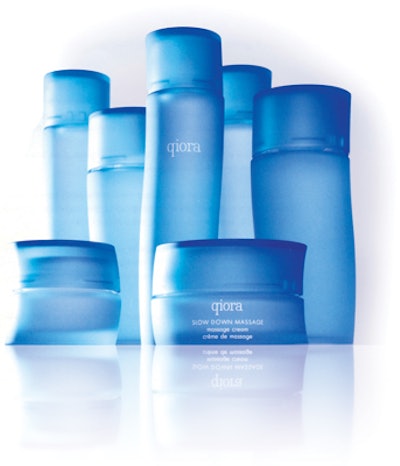
The Qiora line of health and beauty products reflects this notion, de Vlam notes.
What is sophistication’s future in packaging? De Vlam cautions marketers to be selective in playing up the sophistication message. “We have to ensure we don’t over-commoditize sophistication,” he says.
De Vlam says sophistication can take a number of forms in package design:
Sophistication is about attention to detail. Not only do all the components work flawlessly, but there is also a place for every detail and every detail is in its place.
Many cosmetic lines create a very distinct and consistent family appearance. One example is Shiseido. The design of each mascara, lipstick, and compact is precisely engineered to communicate and deliver a look that differs from others across their respective lines.
Sophistication has appropriate elegance and refined simplicity. It is classic yet contemporary, layered with depth of textures, translucencies, and tactility. It is special without necessarily being expensive to purchase. Sophistication is not exclusive to premium brands. De Vlam points to Bud Light’s aluminum bottle as a great example of a brand that takes the higher road of subtle sophistication.
“I subscribe to this code of quiet simplicity because we can’t keep adding icons and violators on the pack to pretend to be better than the next,” de Vlam says. “As long as the product does what it claims, the rest is all about building a bridge between the brand and the consumer’s heart.”
Store brands such as Boots and Marks & Spencer have created an allure with simple, sophisticated typography, placed in spacious white space, allowing the brand to breathe and express itself without nearby violators or background noise.
Sophistication uses packaging capabilities strategically, especially where it concerns an extended brand portfolio (Olay) or an extended portfolio of brands (Anheuser Busch). Sprinkle those capabilities where they are most appropriate and relevant, and be strategic about your choices, de Vlam advises. Anheuser Busch used pressure-sensitive labels on bottles in some of its lines, notably Bacardi Silver and Budweiser Select, shrink sleeves on its BE drink, and conventional paper labels on core products. Olay Regenerist’s unique secondary packaging helps set it apart from Age Defying and Total Effects, which are sold in-store in close proximity to Regenerist.
Sophistication gives a brand room to breathe. Sometimes, a brand mark doesn’t need to be stretched to the limits of the billboard. Sometimes, the white space around the brand improves the focus the consumer needs to spend on other elements of the brand communication. De Vlam says it’s a welcoming trend to see staple brands such as Tide and Downy Simple Pleasures adopt this more mature stance.
There are several benefits to doing so, he says. First, it allows the bottle shape to help communicate the proposition. Second, it helps the rest of the label to link some of the more emotive cues. Third, reducing your brand prominence actually strengthens your brand. Your consumer should remember and recognize your brand from many other visual cues and equities such as the color, touch, shape, and iconography that make up the brand’s appearance. It’s not just about the brand mark. It’s also about emotional optimization.
Want another example? Apply these same concepts to exquisite graphics on bottle labels in the Gillette Series aftershave line.