Tom's Foods has always made good products. But rarely has it put them in packages that anyone noticed. Now that's changing as the company has learned that reduced- or no-fat products demand different graphic and structural packaging approaches.
Columbus, GA-based Tom's worked with The Package Design Center (Dallas, TX) to develop a graphic approach that tells the fat story without a great deal of subtlety-but with a visual appeal aimed at attracting customers new to Tom's products.
"This is really a major graphic change for us. Historically, each of Tom's products has had its own product identity," says Dave Dugan, project manager. "Each package design is specific to a given item. We haven't had a unified design to our packages, except that they all carry the Tom's logo."
Learning from SnackWell's(TM)
Thanks to both the successes and the failures in marketing reduced-fat products by others, Tom's recognized the need to develop a total family of products. Dugan points to Nabisco's early lack of success with low-fat Oreo cookies that were merchandised next to the regular Oreo cookies.
"Then Nabisco developed SnackWell's, where they put all their reduced-fat products into the SnackWell's family, and they merchandised them separately from their regular products. And we all know how successful that's been," Dugan says. With that in mind, Tom's felt it really didn't need to test its products.
"We knew that consumers would look for a family of products sooner than for an individual product with a lower-fat formula."
At the same time, Dugan and Mac Johnson, Tom's senior director of marketing, recognized the need to put together an identity that would communicate the two product attributes for the new line: good flavor and a reduced- or no-fat ingredient statement.
"Our concern was that many of the initial entries into reduced-fat products were products that had little concern for flavor and taste. Some manufacturers seemed to think that if consumers wanted low-fat products, they'd buy them regardless of taste. Many of these products didn't make it," Dugan says.
Vending leads the way
Overall label language became an issue as Tom's worked to develop vending machine graphics for the new line. Originally, the machine would have displayed the legend, "Tom's low-fat snacks." But because of rules developed around the time the nutrition labeling requirements emerged, Tom's realized that consumers might expect that all products in the vending machine would be low-fat. Yet, by Food & Drug Administration definition, many products were instead "reduced-fat" products.
"To be accurate, we adopted the 'Tom's Less-Fat' phrase. Some of our products are, in fact, no-fat products. But for consistency, and to develop a way to identify all our packages, we decided to go with this phrase, along with the 'Great Taste!' descriptor. We wanted to communicate that we aren't sacrificing flavor just for the sake of removing fat. In other words, we imply that if it says Tom's on the package, it's going to taste good," Dugan emphasizes.
Taste aside, FDA has some rigid rules for the language that's acceptable on each pack. That's important because Tom's had some 48 SKUs to consider as it embarked on the first wave of products in the line (another 17 are on the drawing board).
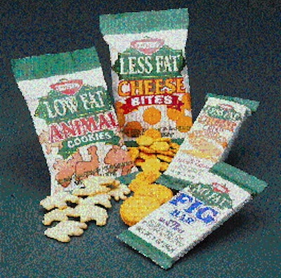
In keeping with the FDA labeling requirements, Tom's decided to develop its packaging around all three levels: less-fat, low-fat and no-fat. All three of these descriptors would work in the diamond-shaped logo that had been developed by The Package Design Center.
Upscale markets
Tom's selected a package family design that it felt would instantly communicate a reduced-fat product. Given SnackWell's success in using the color green, the company felt that consumers recognize that color to denote less fat. "We wanted something to make the green jump out, and the white background helps us do that," Dugan says. "Solid white didn't look quite right, so we added gold pinstripes that give the packages a classy look."
That's important because the new product line is aimed at a more upscale market than is Tom's regular product. Dugan characterizes the traditional Tom's customer as a worker who picks up a bag of chips and a cola at a convenience store. "This customer isn't likely to reach for a low-fat fig bar," he says. That's why the special vending machines for these reduced-fat products will be specifically targeted to schools, health clubs, office buildings and hospitals.
Mac Johnson had worked closely with Dale Smith of The Package Design Center last year to work up graphic concepts, several using the green diamond-shaped logo. Last November, Tom's president, Peter Rogers, put the project on the front burner and assigned Dave Dugan to coordinate.
"We identified 48 SKUs for packaging and we told the designers and our converters that we wanted to be in production February 7," Dugan recalls. "Dale Smith and his group worked real hard, and so did our converters so that we were able to make our dates." Most of Tom's webs are run flexo in six colors. For converters without a six-color press, the gold stripes are done in yellow. With artwork underway, Tom's also had to look at package structures.
Structural changes
Some of Tom's less-fat products, in fact most, didn't involve a structural packaging change, says Charles Middlebrooks, Tom's packaging engineer. But for products like its popular filled sandwich crackers and fruit bars, the reduced-fat formulas required greater barriers than is necessary with Tom's regular products.
"Our regular baked products use a 120-gauge surface-printed oriented polypropylene," says Middlebrooks. "For the sandwich crackers, we had to switch to a lamination of two webs of 70-gauge polypropylene. By going to a lamination, we were able to bury the printing inside by reverse printing the outside sheet. That really cuts down on scratching because we have just about 100-percent ink coverage with this design."
Metallized webs took on special importance for moisture-sensitive items like Tom's fruit bars. "For these products, we use a 90-gauge reverse-printed OPP laminated to a 70-gauge metallized OPP," Middlebrooks says. The metallized layer helps keep the product's moisture from escaping the package.
The metallized web is also used on Tom's popcorn bags, but for a different reason. "Light is the worst enemy of popcorn, so we use two 70-gauge webs. One is reverse-printed. The other is metallized to provide less than two-percent light transmission. The two webs are adhesively laminated," Tom's engineer says.
To provide rollstock for the new reduced-fat line, Tom's uses several different converters, including Bryce (Memphis, TN) and James River (Cincinnati, OH).
Green gets new role
"Based on the success of SnackWell's, our focus group studies show that nine out of 10 people will say that green is the color for reduced- or fat-free products," reports Smith of The Package Design Center. "People have 'gone to school' on SnackWell's, because they've done such a sensational marketing job. I think that some other marketers have switched from other colors to green to denote low-fat products."
The use of green colors on fresh foods packaging is unusual because it has historically been avoided as the color of mold and spoilage. However, Smith says, fat-free foods have also been avoided in the past. "So I think the 'stigma' of green on food packaging is now gone."
This ambitious project has been well-received by the trade, Dugan says. "Even with Frito-Lay's delayed introduction, the company says they expect the reduced-fat line may become as much as one-third of its sales by 1998."