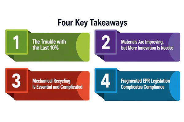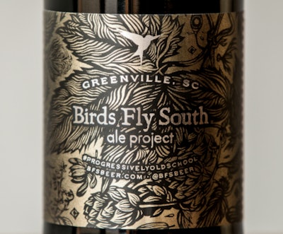
Greenville, S.C. brewery Birds Fly South Ale Project tapped local artist Chris Koelle to help develop a distinctive new standard label. Koelle turned to Greenville’s Frontier Label team to translate that design into a beer label and make it a reality. Working with Koelle and Birds Fly South throughout the design and implementation, Frontier incorporated elements of metallic plastic, resulting in the brand’s signature, emblematic new standard label.
“My experience working with Frontier Label’s pre-production team to solve any and all issues has always been a pleasure,” said Koelle. “As an artist, it’s important to me that my vision comes across organically on the finished product, and from day one, the Frontier Label team was committed to that. They appreciate the creative process and are able to seamlessly translate the details from the art to the label, resulting in a beautiful finished product that is true to the original design.”
The new standard label is a 5.875-in x 10.000-in rectangle on metallic paper with a matte finish. The substrate itself is metallic and once printed on, the inks take on the underlying metallic sheen.It was digitally printed in five colors (CMYK + W), and uses apermanent adhesive that was hand-applied in this case.