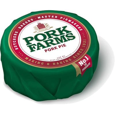
The new design runs across the company’s traditional pork pies, sausage rolls, and snacks, and it emphasizes the brand’s heritage as a maker of quality product. The “pastoral” look of the old packs—which featured the words “Pork Farms” against a grassy landscape and included naïf-style birds perched on top—has been abandoned for a vintage look to emphasize the quality of the products. To this end, the packs have retained their traditional “racing green” and red color scheme, but they now use a “seal of quality” device with a redrawn Pork Farms logo inside a red circle. This device runs across the entire range.
Inside the red outline of the circle are the words “Butchers, bakers, master piemakers: Making and baking since 1931.” Inside the white central area of the seal is a red striped butcher’s apron as a crest, with the words “Since 1931” underneat. Below this, the Pork Farms name has been redrawn and now has a gold outline and a more angular, traditional look.
“For this redesign, we wanted to go back to our roots,” says Andy Napthine, head of marketing at Pork Farms. “We know the brand is loved for its traditional values, and there’s a lot of positive sentiment and nostalgia for Pork Farms’ products among consumers. This new design gives us consistency across our range and really sets us apart from our competitors on shelf. Pork Farms is an established brand with a fantastic heritage and strong quality credentials, and this design reflects that completely.”
Holmes & Marchant designed the new look. John Mathers, managing director at the UK design firm, describes it this way. “The new design for Pork Farms has created a unique look within the category that will really help it stand out on shelf. The seal device has allowed us to create consistency across the entire range. The brand has long been known for the quality of its products, and now the packaging reflects this confidence and pride in Pork Farms’ heritage and role as producers of classic food.”