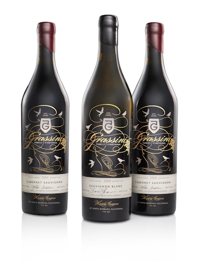
A graceful, stylized tree sketched in gold, encircled by five bird silhouettes in various states of flight and rest is the symbolic representation of the Grassini family tree, used for Grassini Family Vineyards’ new wine label design. Grassini is a family vineyard in the Happy Canyon of Santa Barbara, CA, established in 2002 by Larry and Sharon Grassini.
Since its inception, packaging for Grassini’s wines has emphasized the company’s strong family connection. Its first label design comprised a simple crest with a logo that combines the number five with the letter “G,” inspired by the five Grassini children. After several successful harvests, the family felt it was time to build upon the logo design and create a more robust brand expression.
“The Grassini family wanted to more fully express the idea of family and the legacy of their vineyard,” says Joe Duffy, chairman and creative director for Duffy & Partners, the design and branding firm responsible for Grassini’s new package graphics. “They liked their existing logo, but wanted to express a higher-end look and breathe new life into the brand.”
Working from a base of a dark green, 750-mL glass bottle imported from Italy, Duffy added the metallic, silk-screened image of the Grassini “family tree,” along with the existing logo, the vineyard name in sweeping, elegant type, and a grape-bunch illustration. Under the image is hand-affixed a personally signed and numbered letter-pressed paper label. Bergin Glass Impressions provided the glass decoration, while Printing Services – Napa Valley converted the labels. Topping the bottle for an extra touch of quality is a hand-dipped wax seal.
Upon launch of the new packaging in November 2011, Grassini Family Vineyards noted, “We couldn’t be more thrilled with the results. The bottles are exactly what we wanted—elegant and classy, while eye-catching and different. They are truly one-of-kind.”