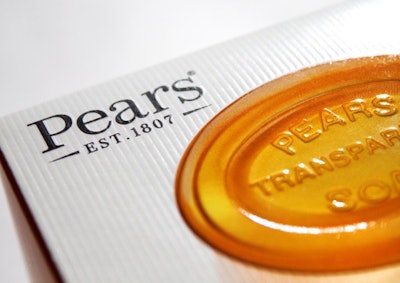
Historic British brand Pears has relaunched its range of transparent soaps with packaging designed by Hornall Anderson in a bid to reposition its products in the U.K. market. Premium design cues and reviving the brand’s heritage were just some of the ways the branding and design agency revamped Pears, which was first produced in 1807.
Pears enjoys high loyalty among current users who are strong advocates of the brand, and it is fondly remembered by those who have used it in the past. It is viewed as pure, traditional, and honest. Its shape, oval contours, and embossing, point to a small-batch hand-made product, but these qualities needed to be emphasized in the packaging.
Hornall Anderson was asked to reinvigorate the heritage and to reflect the premium nature of the product in the packaging. As a result, consumers are currently responding positively to genuine brands with a long history, which will allow Pears to grow its customer base.
The heritage of the brand is illustrated on the front of the pack, with the date 1807 clearly displayed. The box is textured to give the packaging a more premium feel, and the tactile nature of the box recalls the textured bar of soap and its carved edges. New and improved photos of the product appear on the pack. Photos of the bars of soap are embossed and appear to glow, as if light is shining through them, illustrating the transparent quality that Pears is famous for.
The logo and copy harken back to the brand’s heritage, reminding consumers that this is a product with authenticity. And natural ingredients are highlighted on the pack, while the white packaging and beautiful typeface reflect the premium nature of the product. The new logo will be rolled out across the brand.
Managing Director at Hornall Anderson, Kim Van Elkan, says, “The packaging we have created for Pears dials up its brand heritage, authenticity, and the natural quality of the ingredients, creating a more premium feel. This will help the product appeal to its target consumers, who value brands which stand the test of time and who value authenticity.”