Fragrant, fun, modern, irreverent: These are the primary brand attributes Burt’s Bees had in mind when it developed a completely new natural personal care brand targeted at the millennial female consumer. Durham, NC-based Burt’s Bees has offered earth-friendly natural skin, beauty, and personal care products for more than 25 years with tremendous commercial success, based on a clinical-oriented platform. Its new güd brand (pronounced good) pioneers a new category in natural personal care: “eco-fun.”
“The main reason we wanted to launch a new brand was that we wanted to pursue our overall Burt’s Bees mission to build a natural personal care category, and invite a new consumer, a new shopper into the category,” explains Burt’s Bees marketing manager Garrett Putman. “We believe there is quite a bit of white space in natural for a brand that’s really fun, fragrant, and colorful and that appeals to a woman we would characterize as a millennial consumer. What we are trying to do is something that no one else in the natural personal care category is doing.”
From concept to store shelf, the new brand was developed within 12 months, including the design of custom packaging structures, as well as the creation of bright, imaginative flower-motif labels that convey the radiant personality of the brand.
Fragrance is key
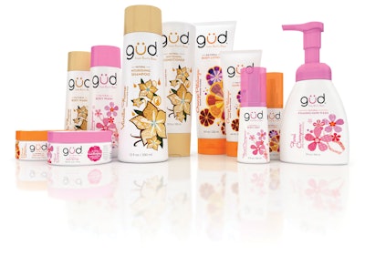
In late 2011, Burt’s Bees launched güd in most major food, drug, and mass retailers in three varieties: Floral Cherrynova, Orange Petalooza, and Vanilla Flame. A fourth fragrance, Pearanormal Activity, is available exclusively in Target stores. Each scent platform includes eight product categories—shampoo, conditioner, body wash, body butter, body lotion, body mist, foaming hand wash, and hand cream—all of which are paraben-, phthalate-, and petrochemical-free.
Notes Putman, product lineup is another area where güd distinguishes itself from the Burt’s Bees brand, which is focused more on lip care, lip color, and body and face care. “Güd is really more about body care, hair care, and hand care—categories where fragrance is really important,” he says.
The brand name, güd, came from Burt’s Bees’ branding agency, Baldwin&, and was chosen for its feel-good appeal. “These products work good, they smell good, and they make you feel good,” says Putman, “so we really thought the brand name was a nice fit for what we were trying to build.” The unique spelling of the name—it uses a “u” with an umlaut in place of the double “o”—is meant to represent a smiley face.
Baldwin& also worked with Burt’s Bees to design the package structures and label graphics, which were vetted through focus groups made up of “millennial beauty enthusiasts,” according to Burt’s Bees creative project manager Julie Colon. As she explains, the focus groups helped the güd team answer three questions related to the package design. First, whether the design evoked an eco-fun, irreverent personality; second, if the design offered a “wow” factor not currently seen in the natural personal care category; and third, if the brand architecture provided easy shoppability for the consumer.
“One of the things that we learned from our focus groups was that in the designs we showed them that used a vertical type format for the fragrance names, the positioning of the copy really started to create a story by connecting it with the illustrations on the packaging,” says Colon. “The consumers began to make the connection between the design and the personality of the brand.”
Packaging consists of custom white high-density polyethylene bottles, made with 20% post-consumer recycled plastic, with a tapered, almost triangular shape, supplied by TricorBraun. While the 12-oz shampoo and the 10-oz body lotion bottles rest on their base, the same style bottle for 12-oz conditioner rests on its cap. “We ended up designing a custom tapered bottle that has a really modern look,” says Colon, “and the different sizes really fit together as a family.” A smaller, custom-designed 3-oz bottle for the body mist replicates the same shape as the larger bottles, but uses a longer cap that covers a pump dispenser. Burt’s Bees chose stock closures for the packages that sit flush against the container, offering a streamlined appearance.
Body lotion and hand creams are housed in 8- and 3-oz HDPE tubes, respectively, supplied by CCL Tube. The body butter and foaming hand wash containers, from TricorBraun, are constructed of PET.
Wraparound, pressure-sensitive labels are litho-printed by Atlantic Corp. in four-color process and overlaid with spot colors and a gloss, aqueous coating. Printing is done with soy-based inks.
Bright colors differentiate
It is really in the label graphics where güd shows its brighter, lighter (even risqué, at times) side. Says Gabrielle Prohn, public relations and promotions coordinator for Burt’s Bees, “If you look at all the other natural brands in the stores right now, you will see that many of them feel really earthy. You will see a lot of natural, earth tones in the packaging design. This is where güd really stands out, with packaging that has a really positive, bright, radiant personality.”
Putman agrees, saying, “When you look in nature, it is full of bright colors. We really wanted to bring that into the category, unlike what anyone else is doing right now.”
Label design was a collaboration between the Burt’s Bees team, Baldwin&, and illustrator Frann Preston-Gannon. The first step was designating a signature color for each brand—for example, bright orange for Orange Petalooza, vibrant pink for Floral Cherrynova, etc.—that was used for the closures. Burt’s Bees and Baldwin& then briefed Preston-Gannon on the color choices and on the personality of each fragrance.
“She took those and created these really beautiful abstract compositions that combine that playful personality with the fragrance name,” Colon explains. Each fragrance variety has a different motif, either flowers, or a pear for the exclusive Pearanormal Activity line, with each flower petal or area of the pear comprising a unique pattern or design, like a patchwork quilt.
“We didn’t want it to look like the exact ingredients that were in the fragrance,” says Colon. “We have this whole idea of mash-ups around the brand. The label illustrations were another way of mashing together the fragrance names with the personality of the brand.”
The güd logo is positioned prominently at the top of the package, in a modern, sans serif typeface using lowercase letters, and uses the color designated for the fragrance in the “u” of the logo. For promotional materials, Burt’s Bees signifies the umlaut with flowers to emphasize the brand’s fun, fragrant character.
Putman adds that the logo lockup includes the phrase, “from Burt’s Bees” to capitalize on the 99% brand awareness of the Burt’s Bees natural brand in the U.S. “Having that Burt’s Bees brand heritage on the package and in our marketing gives us a lot of credibility when it comes to natural so that we don’t have to ‘scream’ that every single time we communicate with the customer,” he says. “We are able to play up our eco-fun personality based on that.”
On the back panel of each package, a flower graphic that mirrors the illustration on the front of the pack is positioned at the top of the label, and includes a brief, fun phrase, such as: “For hair that says ‘Touch me.’ Talking hair, pretty nifty.” “Like a love letter to your skin (without the naughty parts).” “Is this guest bathroom soap? Only if you like the guests.”
A QR code in a complementary color on four of the product forms—body wash, body lotion, shampoo, and conditioner—can be used by consumers to unlock “güdees” through their smartphones that include coupons, mobile wallpaper, or a ring tone, to name a few. Putman says the codes are a “fun and interesting way to communicate with this young, modern woman.”
Güd response
Since its launch late last year, güd has made fans of both retailers and consumers. “Retailer response has been really quite strong,” Putman relays. “When we went in and showed our insights and our concepts and our positioning, and we started sharing packaging, we got a lot of nods from our key account partners. They believed in the white space that we were showing them. They continue to be strong advocates for the natural personal care category. They were really energized and excited about the fact that the Burt’s Bees organization was going to bring a second offering to the table and really focus on bringing a new consumer down the aisle. So retailer acceptance has been extraordinary through this launch. We are quite pleased by that.”
Social media-savvy millennial consumers are also showing their appreciation for the brand, making güd the number-two brand in the natural personal care category in terms of the number of Facebook fans (325,000+). Confirms Putman, “From the consumer standpoint, we are quite pleased with how things have gone out of the gate.”