This philosophy has now been carried over to a new line of products for babies, Cetaphil Baby, developed to be gentle and effective for everyday skincare.
According to Galderma Vice President & General Manager Self-Medication Business, U.S., Miles Harrison, distinguishing the line from other products in the baby-care category is Cetaphil Baby’s combination of benefits: organic calendula, medical endorsement, and the exclusion of harsh chemicals. “Specifically focusing on our ingredients, the key ingredient featured throughout the line is organic calendula, derived from the marigold flower and used for centuries to soothe sensitive and irritated skin,” he says.
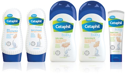
The line comprises a daily lotion, a wash and shampoo, a diaper cream, a moisturizing wash, and a moisturizing oil. Wash products are packaged in a custom, inverted, 7.8-oz white, high-density polyethylene bottle with a blue polypropylene flip-top closure. The bottle, designed by supplier Sauer, has a textured surface that provides a no-slip grip, helping to prevent drops during bath time.
The lotion and oil are packaged in a 13.5-oz HDPE bottle with a gently curved waist that conveys a feminine silhouette and also provides grippability. A blue PP overcap tops the bottle. The diaper cream comes in a 3.5-oz tottle with a blue PP flip-top cap. Suppliers include Sauer, RPC, and Global Closure Systems.
To create packaging graphics that would highlight the product’s differences at point of sale, Galderma conducted a competitive analysis of products on shelf. “We determined we needed to incorporate baby-specific design elements to soften our brand and emotionally connect with moms,” explains Harrison. “We chose to add bunny and elephant character graphics to achieve this emotional connection, using a softer watercolor effect to drive home that these products were created specifically for baby.”
Precipice Design Ltd. designed the package graphics, with the pastel baby bunny and elephant illustrations—intended to be reminiscent of a children’s book illustration—created by Ben Sanders. Emphasizing the use of calendula in the products, the character graphics each hold a large marigold. At the top of the bottle is positioned the Cetaphil branding, along with a custom-drawn “baby” sub-brand logo.
Bottles are decorated with offset/screen-printed polyethylene labels, while tube graphics are direct flexo-printed. According to Harrison, the main challenge in bottle decoration was how to reproduce the number of colors required consistently for a variety of products and print processes where limited colors were available, while maintaining the core brand elements together with the effect of watercolor illustrations. The solution was to substitute the CMYK colors required for the illustration with special Pantone inks required for the branding. “By working with the repro house and vendors, we were able to achieve a consistent brand presentation and a full-color effect for the illustrations,” he says. “The Precipice team worked to extremely tight timelines to resolve the complexities of including the text, graphics, and illustration elements in a variety of limited label areas.”
Cetaphil Baby launched nationally in March 2015.
