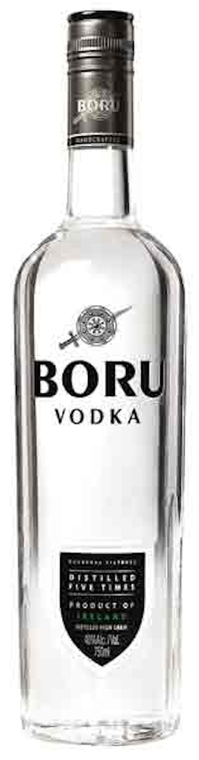
Claes G. Fick, Castle’s chief commercial and marketing officer, notes, “Having a very high-quality product in the premium segment is not enough. We took a hard look at the playing field and realized that our old packaging did not measure up to the quality of the bottle’s contents.”
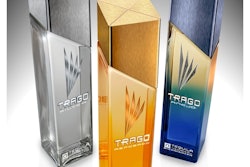
The new crystal clear bottle and striking logo were designed by London, England-based Claessens International (www.claessensinternational.com). The design retains Boru’s traditional black-and-silver palette, but incorporates a more contemporary look. The bottles are supplied by Glaswerk Ernstthal GmbH & Co., a unit of packaging wholesaler/distributor August Pohli GmbH & Co. (www.pohli.de). Bottles bear a sword and shield icon above the brand name, deep vertical side-panel cuts representing swords, and a debossed black shield announcing that the Ireland-originated, charcoal-filtered vodka is distilled five times.
Label Art Ltd. (www.labelart.ie) and Lappi Industrias Graficas S.L. (www.grupolappi.com) provide labels. Bottle closures are from Guala Closures S.p.A. (www.gualaclosures.com) and Viscose Closures Ltd. (www.viscose.co.uk).
Mark Andrews, chairman and CEO of Castle Brands Inc, says, “by increasing Boru’s distillation from four times to five times and completely redesigning its packaging, we are, in effect, launching a new brand.”