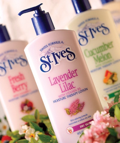
With the help of designers at Maddock Douglas and consumer feedback, the redesigned packaging and graphics are less cluttered than previous designs. The contemporary new look maintains the recognizable aspects of the earlier lotion dispensers, while enhancing its shelf appeal. Each different scent is identified in its own, unique color and is accompanied by graphic cues that also represent the lotion type. The familiar St. Ives logo set against a graphic of the Swiss Alps is still displayed prominently at the top of the package. According to the company, the new packaging has been very successful and continues to embrace the brand name while achieving a more modern, updated look.
Companies in this article