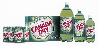
This month, made-over packaging for Plano, TX-based Canada Dry ginger ales, mixers, and sparkling wines will hit consumer shelves with a cleaner, more contemporary image designed to communicate its wholesome, optimistic, and uplifting brand attributes. “We wanted to make certain that the package designs for each of the products in the portfolio had a consistent look,” says Chris Creedon, dir. of brand marketing for Canada Dry. “The new, modernized packaging graphics will increase shelf impact, while differentiating Canada Dry from its competitors.” The new design, created by Landor Associates (San Francisco, CA), uses the well-known Canada Dry shield more prominently against a green primary background color. The Canada Dry Tonic Water line will continue to use a yellow background color, while the Club Soda will use blue. Canada Dry sparkling water packages will use clear labels, color closures, and product descriptors to enhance the product “personality,” such as “Cheerful Cherry,” “Amazingly Mandarin,” and “Lemon Lime Twist.” Creedon concludes, “With the new designs, consumers should have no trouble finding Canada Dry on store shelves.” —ALR