Over the last two years, the personal care products segment for kids has undergone a major change, with a growing number of companies introducing premium products that follow the free-from trend. Suave Kids has been a pioneer in the kids’ haircare category, but with the slew of milder products entering the market, it needed to recapture its lapsed consumers with its own free-from product.
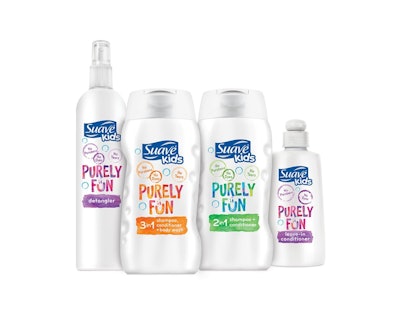
After formulating a line of four hypoallergenic products free from parabens and dyes, Suave chose Smith Design to create the naming, identity, and package design for the brand. Smith’s directive was to convey the mildness, gentleness, and purity of the products while remaining appealing to kids.
To guide the direction of the design, the Consumer Market Insights Group of Suave’s parent company, Unilever, conducted testing that confirmed the product’s positioning of purity and showed that a clean white design signaled that message to consumers versus the sea of bright colors traditionally used for kids’ product.
The resulting Purely Fun brand uses the same PET bottle structures used by the existing Suave Kids’ line to maintain consistency, but swaps out the brightly colored background with a white one along with nearly translucent touches of color. A purple/orange combination is used for the leave-in conditioner and detangler products; an orange/purple palette for the 3-in-1 shampoo, conditioner, and body wash; and green/blue for the 2-in-1 shampoo and conditioner.
“The colorway was applied with a watercolor quality for a more hand-done feel but still ties to the established segmentation of the base Suave Kids line,” explains Jenna Smith, Managing Partner at Smith Design. “The Purely Fun logo and font treatments cue ‘transparency,’ a quality that fits the line. The ‘u’ in ‘Fun’ is smiling, adding a friendly wink at shelf, while illustrations of soft, floating bubbles carry the product’s unique benefits.”
The Purely Fun line was introduced in January 2016 in Target, with greater distribution to follow.