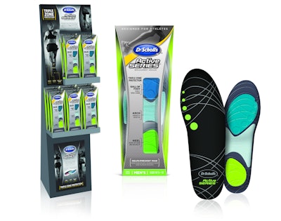
For its new Dr. Scholl’s Active Series line of insoles for high-performance athletes, Merck worked with brand strategy and design consultancy Product Ventures to harmonize the product, package, and POP display, and to differentiate the line from other Dr. Scholl’s foot-care products found on retail shelves.
With the bulk of its retail insole products designed around comfort and pain relief, Merck looked to Product Ventures to bring the brand into the performance world with unique aesthetics for its Active Series. Product Ventures graphics and structural teams worked holistically in designing the athletic-inspired insole, the packaging, and the displays to convey high performance, movement, and modernity. “We created a brand mark look and feel, while retaining a number of the Dr. Scholl’s equities,” explains Product Ventures CEO Peter Clarke. “We wanted to give them the new personality they were looking for to really target athletes and play in a different space.”
The insole itself is engineered for Triple Zone Protection, targeting three areas of the foot—the ball, the arch, and the heel—with specific advantages. For each zone, Product Ventures created a different texture and color, inspired by current athletic trends and footwear styles. The signature color for the men’s insole is a “candy-apple green,” while the women’s version uses a bright fluorescent pink.
The primary package is a clear PET folding carton, with a pinch-waisted contour. Product Ventures specified die-cut windows over each of the three insole zones that allow the consumer to feel the cushioning or rigidity of each. “Ideally, packaging should help you to engage all of the senses, not just sight,” says Clarke. “So if you can bring in the feel of a product, especially when you are dealing with these types of insoles, where there is a huge tactile difference between the cushioning areas and the more supportive areas, that’s very important.”
The carton is screen-printed with a grey dot pattern, which is repeated in the texture of the arch, for continuity between the product and package. Says Clarke, the repeating dot pattern was chosen to convey the repetition of running, or the counting footsteps on the pavement, while a crisscrossing line pattern on the ball of the insole conjures up “limbs swinging, or your hair blowing in the wind.”
Above the die-cut window on the package is the blue-and-white Dr. Scholl’s nameplate, building on the brand’s equity, but the bright yellow background that sweeps across many of Dr. Scholl’s packages is translated as a slim, ribbon in the Active Series, almost like “running across the ribbon at the end of a finish line,” says Clarke. At the top of the package is a stylized black-and-white photo of a person running, adding drama and visual intensity to the design.
Clarke attributes the unified message of the brand, launched in August 2012, to the unique partnership forged between industrial and graphic design. “By having the teams work together, the design aesthetic developed for the insole was translated to both the packaging and the in-store displays creating cohesive communication across the brand.”