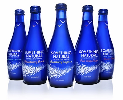
An elegant, white flock-of-birds motif against a cobalt-blue background dominates the package design for a new line of all-natural, flavored sparkling water beverages. Something Natural, introduced in the Boston and Toronto areas in early 2011, was developed as a natural alternative to artificially flavored, carbonated beverages and so employs a package design that speaks to the brand promise of crisp, healthy, refreshing, and natural.
“We are simplifying refreshment,” says Cheryl Meyer, Something Natural director of communications. “Many beverages have overreached on claims, and consumers are suffering from functional fatigue. Something natural tastes great and is much healthier than carbonated options on the market today, such as traditional colas.”
The beverage, which is free of preservatives and artificial flavors and has just 30 calories per serving, blends sparkling water with fruit flavors in five varieties: Black Cherry, Blueberry Lemon, Pink Grapefruit, Raspberry Keylime, and Strawberry Peach. The drink is packaged in an 11-oz cobalt-blue, custom glass bottle (supplier proprietary), which Meyer says was selected because of its premium appearance, its recyclability versus PET, and its ability to protect product stability and quality. “And,” she adds, “beverages taste better out of glass, especially waters.”
To convey a brand image of all natural, yet modern, and to differentiate Something Natural from its competitors, the beverage company chose Little Big Brands to create the masterbrand identity, as well as the primary and secondary packaging. Through focus groups, Little Big learned that consumers want “straightforward messaging and products that don’t overreach,” says Little Big creative director John Nunziato. “Our goal was to make Something Natural synonymous with simple, all-natural refreshment, and we believe that our packaging expresses that.”
The main graphic element of the package, the flock of birds illustration, runs across the bottom of the front panel. Says Nunziato, “The inspiration for the flock came from the bottle itself. The gorgeous blue bottle just seemed to be begging to be used as a canvas. For us, the idea of a flock of birds flying freely in a clear, blue sky is one of the most natural things you could ask for.”
The flock, as well as an illustration of two birds on the neck of the bottle, and the brand logotype and flavor identifier are screen-printed onto the glass in two colors—a special white and a color designating each flavor.
Says Meyer, the package design has been the catalyst for some consumers to try their first Something Natural. She adds, “Little Big Brands did a great job creating a package that was not only aesthetically attractive, but most importantly, commercially viable.”