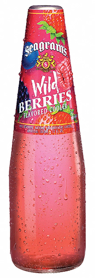
Last summer, for the first time in nearly 20 years, Seagram’s Coolers switched from their traditional teardrop glass bottle shape and introduced tropical graphics on labels and carriers for their fruit-flavored alcoholic drinks.
Once a part of the Seagram Beverage family, the line of coolers is now owned by distiller Pernod Ricard, Paris, France, and the brand is managed and marketed in the United States by United States Beverage, L.L.C., of Stamford, CT. This company was responsible for developing the graphics for the new label and four-bottle carrier.
Seagram’s Coolers are packed at the former Seagram distillery in Lawrenceburg, IN, as well as at two copackers. The Lawrenceburg plant, now owned by Pernod Ricard, also fills Seagram’s Smooth, a newer line of flavored malt beverages also marketed by United States Beverage.
The bottle shift and graphics overhaul for what are now called Seagram’s Cooler Escapes were designed to present the products in a more contemporary package with more consumer appeal. However, the development of the new bottle with supplier Owens-Illinois resulted in some production line and purchasing efficiencies as well.
Coincident with the new packaging, the brand introduced new flavors for the coolers, and late last year introduced Winter Breeze, a seasonal cranberry-apple flavor scheduled to be marketed through January 2005.
The new look
“A full year in the making, these changes are as dramatic as you will see in the beverage business,” said A. Peter Gyimesi, vice president of marketing for ready-to-drink products at United States Beverage. “The brand is contemporary and appealing for existing, loyal customers as well as for those discovering the product for the first time.”
Before the packaging was changed, the company conducted 18 months of consumer research, adds Richard Cho, senior brand manager for Seagram’s Coolers. “Since the packaging hadn’t changed in 20 years, we felt it was a little dated,” he says. “So we wanted to change the look of the bottle and the graphics to create more contemporary packaging for the twenty-first century.”
For those two decades, Seagram’s Coolers were filled into a teardrop-shaped bottle and decorated with a neckband label that enclosed even part of the crown. “Sometimes, the label made it difficult to drink from the bottle,” Cho says, “so the new bottle is more convenient for the consumer.”
Designed in-house, the new label and carrier graphics take on a tropical theme. “It’s a look that consumers cannot help but notice,” adds Gyimesi. “The graphics suggest a refreshing get-away, a break from routine.” Labels are printed offset in six colors by Cameo Crafts Intl.; the carriers are printed gravure by Smurfit-Stone.
Designing the bottle
At Lawrenceburg, the packaging line for Seagram’s Cooler Escapes is also used for Smooth bottles, each bottle with a unique shape. That difference, however, required extensive changeover on the line when converting from one bottle to the other, says Brian Keating, senior director of purchasing for Pernod in North America.
“Our marketing people wanted to use a new bottle with more of a beer-bottle shape for Coolers,” he says. “We worked closely with Paul Morehead, head of design at United States Beverage, and with Owens-Illinois’ glass mold designers. Within the same footprint, we tried to come up with a different bottle that would give marketing the cues they wanted.”
In essence, together with O-I, Pernod was able to make the Coolers bottle a little taller and dropped the shoulder a bit, he says. “But we kept the bottle diameter, the label positions, and the slope of the neck the same as the Smooth bottle,” Keating points out. “This meant we could use similar parts downstream, for example, in case packing.”
Efficiencies were also gained in bottle making. Although there are some differences between the Coolers and Smooth bottles, O-I is able to use the same blank molds for both. “All they have to do is change the blow molds, not the blank molds,” Keating says. “So it was very fruitful in terms of bottle cost and in terms of efficiencies in our production environment.”
Two different labels
In other ways, the two bottles couldn’t be more different. Seagram’s Smooth uses pressure-sensitive labels, while Coolers employ cut-and-stack labels applied with wet glue. Label shapes are quite different, too.
“The Smooth label is rectangular in shape and that bottle uses a back label,” Keating says. “The Coolers label is much wider with a rounded arch in the middle that’s repeated in the graphics of the carrier.” For bottles filled at Lawrenceburg, the back labels are pre-applied so that only front labels are required to be applied in its line.
At the copackers’ plants, each brand is packaged on a different line so that front, neck and back labels can be applied in-line for Smooth, while the Coolers front and neck labels are also applied with glue from cut-and-stack magazines.
In addition, says Bill Pulton, director of packaging of finished products at Lawrenceburg, the plant has now converted from receiving bottles in tab-locked reshipper cases to bulk glass, much like the two copackers had already been using. This conversion began in November, Pulton says, and was a separate project from the glass bottle redesign. In no small way, it simplifies the bottling process and helps reduce costs and inventory issues.
“We’re very grateful to our suppliers for their help in a quick turnaround on this project,” says Keating. “This is a high-volume business, and with twelve different products, each with different graphics, plus a new bottle, new label shape, new carriers and shippers—it was a huge job.
“And the labels are different for each location because of mandatory copy. With wine coolers alone, we’re looking at about 42 different SKUs because of copy changes. There was a tremendous amount of work to get all the art completed and approved.”