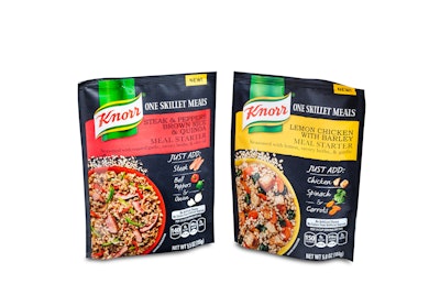
The packs are meal kit concepts that contain seasoned organic whole wheat couscous or organic ancient grains like barley or quinoa, which people can then pair with vegetables and proteins from the fresh aisles. FPA judges awarded this package design a Gold Award for Printing and Shelf Impact.
“This is our first offering in the meal-kit category,” says Elizabeth Doval, Marketing Innovation, Unilever. “It’s also a more foodie product, aimed at people who want to try new flavors and experiment while cooking, and ultimately, our aim is to inspire people in the kitchen. Which is why our tagline is: ‘Don’t just eat, discover.’”
The new three-ply film package features a darker background color, giving it a softer, more prestigious look, with a registered matte lacquer allowing the brand logo and product image to remain glossy and jump off the package.
“We listened to the consumer testing that identified that black matte cued premium quality to people” says Alex Faust, Packaging Engineer, Unilever. “They wanted it to look natural, but oddly enough, they didn’t like paper pouches. However, we found that matte cued premium, quality, and natural, so that’s the direction we went. Those were things that we got from the consumer insights and then applied that to developing the pack. And then to further elevate the pack, we chose to include a registered matte coating so we were able to have key areas pop with a spot varnish.”
The consumer research also indicated a preference for easy opening. Because the pack is thicker than Knorr’s typical line, Faust decided to implement laser scoring to allow for a clean and easy open. The three-layer pack includes an unspecified barrier layer to block entry of moisture and oxygen.
Converter American Packaging Corp. achieved Unilever’s desired specifications for the pack by using reverse-printed hi-flexo and a registered matte lacquer to provide a matte/gloss combination. The soft-looking, darker background was accomplished with a reverse trolley gravure cylinder to lay down the registered matte lacquer while leaving the shiny rich accent colors to pop and help accentuate the brand logo and life-like product image. The selected structure provides the required protection along with special enhancement properties desired for the graphics.
Also of note, these packs can be displayed at the retail level in eight-count retail-ready trays, which are made by Pratt Industries. Not only do these trays hold and display the packs well, they also are a continuance of the brand image.
“Plus, to ensure the premium brand image continues beyond the retail environment, we incorporated a K-Seal on the bottom to help the pack stand up not only on retail shelves, but also in peoples’ homes,” Faust adds.
While these stand-up pouch meal kits are a natural for the meal kit aisle near rice, pasta, and other dry ingredients in retail aisles, Unilever also aims to place them in areas near the variant ingredients themselves—the vegetables and proteins these meal kits incorporate.
Also involved in creating the package concept were design agencies JKR, Southern Graphics Systems, and SGS Canada.