Hawaiian sweet bread maker King’s Hawaiian has expanded into new products, a move that prompted an update of its brand identity. The history of the company dates back to the 1950’s when Robert R. Taira, the Hawaiian-born son of Japanese immigrants, opened his first bakeshop, Robert’s Bakery in Hilo, HI. Renamed King’s Bakery in the ’60s, it became known for Original Hawaiian Sweet Dinner Rolls. Now a national brand with products available in grocery stores across the U.S., the company is introducing new products, including a line of barbecue sauces.
Says King’s Hawaiian CMO Erick Dickens, “We realized as we started to think about expanding our product line that our visual identity wasn’t going to translate well. We also wanted it to stand out in new TV ads as we share the Hawaiian way with a broader audience and new products.”
For this they turned to the brand design firm Flood Creative NY. According to Stuart Whitworth, Flood’s Chief Creative Officer, “We soon realized that the entire design of the flagship bread bag was the brand icon, versus any particular element on it. That didn’t exactly translate effectively to other products. The original logo was mainly typographical and lacked a symbol that would boldly connect with the King’s Hawaiian spirit. So we pursued a new identity that would embody the heritage and create a new authentic and proud badge for the growing business.”
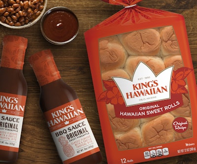
Flood Creative focused on the brand’s biggest equity, the bright orange color, but took the crown, which was a tiny element on the bottom of the original logo, and made it big and bold. Rather than an actual crown, it represents a stylized version of the top of a pineapple, one of the most popular and recognizable fruits grown in Hawaii. “It’s proud, bold, and suited for application across a wide variety of new products,” notes Whitworth. To further reinforce its origins, Flood framed the crown with hibiscus, Hawaii’s state flower.
Barbecue sauces—a product that fits in with traditional Hawaiian cuisine—comprise the first line extension. A shrink-wrapped cap covered with images of hibiscus complements the bold new logo on the label.
Says Whitworth, “It was an honor to work with a family-held business that was open to change.”