A major driver of packaging innovation today is the need to sell brands at the point of purchase. Crowded shelves, a shift in retailing toward super stores and club stores, and newer brand strategies are impacting package design and structure.
To assess the scope of these challenges, Packaging World convened a roundtable of thought leaders in packaging development. They are designers, managers at consumer packaged goods companies, and a researcher (see Panel Members sidebar, p. 60). Led by packaging consultant Jim Peters, the group offered a perspective on just how effective packaging can be when consumers make their in-store buying decision.
Jim Peters: Superstores and club stores continue to grow at the expense of traditional grocery outlets. How do these growing retail channels add special packaging challenges?
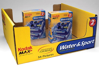
Jim Scott: We do a lot with both club stores and superstores. They all want something different from what consumers will find in conventional retail channels...primarily they want products in larger sizes. A good example is the Kodak Water & Sport one-time-use camera. We sell it in a two-pack primarily for club stores. That gets the price into the “higher ring” category those stores want.
As with many club store packages, this package appeals to two buyers. First is the consumer who has a big enough family to buy two cameras. But we also have to appeal to the small retailer who buys from the club store for resale. That buyer may be a small sporting goods store or an oceanfront fishing shop. To accommodate both, we make the package “breakable”...that is, we design it so the small retailer can open the package and resell each of the individual cameras.
The result is a packaging project that has to coordinate four elements: A primary package that has to be labeled for subsequent resale; a secondary two-pack; a display tray with graphics to help the consumer find this product in the club store; and finally, the pallet configuration that will help these products survive the distribution system and yet be “shoppable” in the store setting.
Scott Young: There is a growing awareness of channel-specific packaging—a different package for each channel. From a testing point of view, we do “reality checks.” How do we adapt the traditional—or perhaps the new—package to new retailing environments?
Art Herstol: One of the things we’re cognizant of is that consumers in club stores are looking for a great value. We need to maintain the essence of our brands, but it is about communicating value. One of the ways to accomplish this is to leverage the shipping carton, which acts as display and primary communication vehicle in this environment. In super stores the situation is quite different.
The primary consideration is that consumers don’t have a lot of time to shop. They may be facing up to 30ꯠ items in less than 30 minutes. It is about the “first moment of truth” when a consumer has to locate and choose between your product and your competitors’. The strategy here is to eliminate all unnecessary copy and focus on the central messages.
Liz Grubow: With beauty products, you have to strike the balance between what your brand is and what you are going to do to fit into the retail environment. It is a balance of the brand and value. You never want to trade down on the essence of the brand. You don’t want to wind up in the bargain bin.
Jim Peters: Given the clutter and that shoppers are time-pressed, are we seeing a shift toward simplicity and toward icons as a packaging communication tactic?
Jim Scott: I’m seeing this primarily in high-tech products such as our digital cameras. Our proposition is similar to the one George Eastman developed over a century ago: “You press the button, we do the rest.” The packaging has to reinforce that message, and for our digital cameras, we have simplified the front-panel graphics tremendously.
Scott Young: I see a shift toward simplicity. The more clutter there is—and it is growing—the more people are using visual language, rather than words, to sort products. They have to sort by colors, visuals, shapes and icons. The more choices there are, the more they have to do.
Words come into play when shoppers have one product in the left hand and one product in the right hand, and they’re making a purchasing decision based on product attributes. But you have to use non-verbal cues to get them to that point.
Jim Scott: I see that too. There are a percentage of shoppers who want to know all the details. You have to give that to them. That’s why we have very detailed product information on the side of each package.
Scott Young: Another reason for simplicity and icons is that you are seeing more and more multilingual and global marketing. Packaging needs to be more visual because multiple languages become cluttered and ugly on the package. This is not going to go away. Effective visual communication is critical to creating packaging systems that can work globally.
Liz Grubow: In beauty care, we see, too, the issue of clarity extending as we go international. You are seeing packaged brands extending into regions and economic tiers where they never were before. Literacy rates vary. Television and word-of-mouth become important media. You have to communicate your value proposition with identities not relying on words. You have to deliver that with graphics.
Dave Fiedler: The need for multilingual packaging is another way a package can get cluttered. It’s a challenge to accommodate all of that copy and communicate your message when the consumer gives you two seconds of attention.
We use icons and photography to show contents, product usage, and product benefits. These devices eliminate words and make it easier for the consumer to access information.
Jim Scott: We have to accommodate that in a way that keeps costs down. With the Kodak Easy Share digital camera line, we do that with structure. The package is in a box with a sleeve that slides over it. The package’s interior is the expensive part—the box and the interior structure that holds the camera and the accessories. We make it generic—it works anywhere. We put all the changeable information on the sleeve...it’s the inexpensive part.
So, since the French is different in Canada than in France, we can have different versions of French. If marketing has a special promotion—a starburst for a few countries in Europe—we can introduce that with minimal cost.
Jim Peters: The nature of the way things are being sold today is changing. We are extending proven brands, and the challenge in package design is to reinforce the core brand yet differentiate the various subbrands. And Liz mentioned international considerations. How is that translating into package design?
Art Herstol: This is one of the biggest challenges to the mega brands. Brands like Pantene that have a broad appeal. We need to look at the full spectrum of packaging options to make it easier for the consumer to identify the specific products they want. One packaging tactic is color, another is shape, a third is graphics, and the last is words.
Look at the different segmentation and hierarchy on some of these lines—it is branding, sub-branding, down to a specific version and benefit to the consumer. You need to use that full range of graphic options to define and explain each of those levels to the consumer on the front of the package—and make it look good in the process.
Look at our Pantene brand. The shape strongly defines the brand, and then we have color to differentiate lines within the brand. We divide the franchise up by ‘collection’ and we use color to do that. As we move down the hierarchy, we then use graphic symbols or icons, and finally words.
An example is the Pantene collection called “Relaxed & Natural for Women of Color.” We use the shape that defines Pantene, but we use a bronze color for the bottles to define this collection and distinguish it from the core franchise.
Dave Fiedler: Line extensions create news for brands and can increase shelf facings—anytime a brand can get another facing is a plus. The challenge is to find a way to differentiate the extensions, but maintain the brand’s core equity.
One thing we hear through research is that consumers are constantly picking up the wrong product, and they’re not happy about it. Look at Motrin as an example...How do you signal the difference in form, yet maintain a strong link to the brand?
The strong orange color is maintained, but form differentiation is communicated through a color triangle in the lower right corner of the package. There has to be a balance—the more space you give to communicate the line extension, the more you are taking away from the brand color. It is a fine line and could be a matter of millimeters.
Jim Peters: The Pantene line is interesting because it uses shape as the prime differentiator. Is this a trend that will extend across packaging?
Scott Young: Shape is a huge trend, perhaps the number one trend we are seeing today. Maybe even five years ago, 90 percent of all the new packaging systems that we tested involved changes in graphic design only. Today, about one-third involve a structural component.
In particular, we’ve found that packaging shape can be an important differentiator and can set new terms or product expectations. Look at motor oil. When Quaker State moved to a slender bottle, the sleek look conveyed a more high-tech, up-to-date modern product.
Shape is a powerful weapon. In the orange juice category it’s juice in carafes, and part of the strategy is being able to shift the category in terms of price points. Shape helps define the serving occasion and changes price expectations.
Shape also affects functionality. We also see a lot of structural innovations tied to portability and to serve new usage occasions. For example, many snack products such as candy and chips are now in cups so that they can be eaten on the go and in the car.
Dave Fiedler: Shape is so powerful that it can change the way a brand is experienced. Look at Altoids—the tin turned eating mints into a social occasion where you share them with friends and coworkers. The milk category offers structures that are more appealing and appropriate to the category. A structure can change the way a product is perceived and even create a stronger brand experience.