To stand out, products need to be contemporary in their communications
and dynamic in their package design to relate the brand essence in a few
seconds.
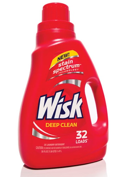
Wisk has accomplished both of those objectives with a bold, premium new look that makes the brand approachable. The design speaks to the essence of this iconic brand while providing a canvas to highlight Wisk's new “Stain Spectrum Technology.” It embraces the brand's heritage, strengthening its presence with strong red color-coding and a new logo.
Both the bottle and the label are rich reds, and the label itself uses several reds to integrate seamlessly into the overall package structure. The logo was redrawn and maximized in perspective form, and its white color jumps off shelf. The addition of reflective foil adds to the brand's premium appearance and strengthens cleaning cues. Smart, modern typography rounds out the label.
Finally, the design was stripped of unnecessary copy, drop shadows, in-lines, and fluorescent colors, which made the previous design feel heavy and dated, says John Nunziato, creative director for Little Big Brands, which created the new design.
The result is a brand with renewed depth, dimension, and energy.
Companies in this article
