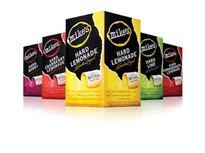
Mike’s Hard Lemonade’s namesake flavored-spirits brand is built on breaking the rules of its category and also by strengthening its visual equities through design. The result is a sales increase of 15% to 20% compared with competitors in the flavored-spirits aisle.
The company, based in Vancouver, British Columbia, Canada, evolved the Mike’s Hard Lemonade brand by working on a redesign with Anthem Worldwide, a Schawk strategic design company.
“Anthem’s understanding of the core essence of the brand and key consumer insights allowed them to quickly establish credibility with the brand,” says Chris Pfeifer, director of marketing, Specialty Beverages, at Mark Anthony Group, parent company of Mike’s Hard Lemonade.
The new design crafts a sense of authenticity, character, and individuality for the brand by evolving and focusing on key on-pack attributes, adding the words, “A Canadian Original” in script below the brand name. The redesign broadens the personification of the brand by presenting its on-pack visual equities in modular form, making the package easier to visually navigate.