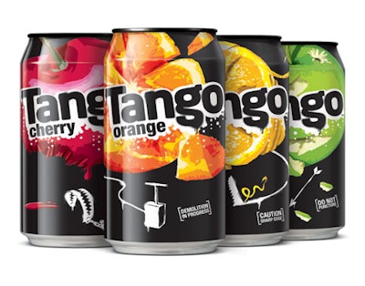
If your consumers respond favorably to irreverent fun, that bit of knowledge could open up design possibilities and give your brand an edge on shelf. Britvic Soft Drinks is taking the irreverent approach on each package format for its Tango carbonated fruit drink, from cans to bottles to six-packs, to raise the level of interest and engagement with the brand.
Some soft-drink brands use on-pack images of fruit to connote an innocent and often child-like brand image, but that approach doesn’t attract Tango’s target audience. Tango’s new design, created by Blue Marlin Brand Design (www.bluemarlinbd.com), features images of seriously mashed-up fruit and graffiti-style type, staged against the brand’s iconic black-and-white background.
The “slap” comes from Tango’s big, fruity taste hit and the “tickle” is provided by copy below the main image on each can front that provides deadpan humor, such as “Demolition in Progress.” The humor reflects the brand’s refusal to take itself seriously.
“The new design is a modern and fresh expression of the Tango brand proposition that will be really impactful on shelf, as well as having elements of discovery for consumers as they get closer to the packaging,” says Sally Symes, Tango senior brand manager. “The design is a significant change and will prompt a reappraisal of the brand, but it is also very recognizable as Tango, which is vital.”