New Tool: ProSource
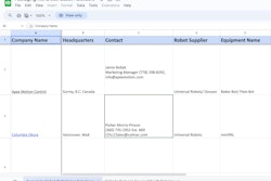
Checkout our packaging and processing solutions finder, ProSource.

'Fresh-roasted' design

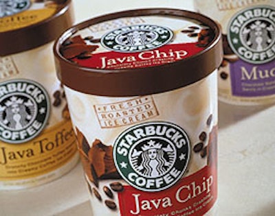
Whether it’s coffee or ice cream, Seattle-based Starbucks continuously works to strengthen its brand identity. Facing fierce competition for premium freezer case space, Starbucks turned to Enterprise IG (San Francisco, CA) to create an exciting new look that would stand out from the competition and also provide a more unified brand identity.

Pw 16903 Starbucks

Designers at Enterprise IG utilized the distinctive Starbucks logo as the central focus of the package, while also using design elements to communicate specific product attributes. The logo was enlarged and highlighted by a light, cream-colored background. “Our strategic understanding of the problems involved with horizontal brand extensions gave us the tools to balance the brand strength of Starbucks with the visual qualities necessary to compete effectively in the super-premuim ice cream category,” a consultant at Enterprise IG says. At press time, printing specifications and distribution information were unknown.
Discover Our Content Hub
Access Packaging World's free educational content library!
Read More
Discover Our Content Hub
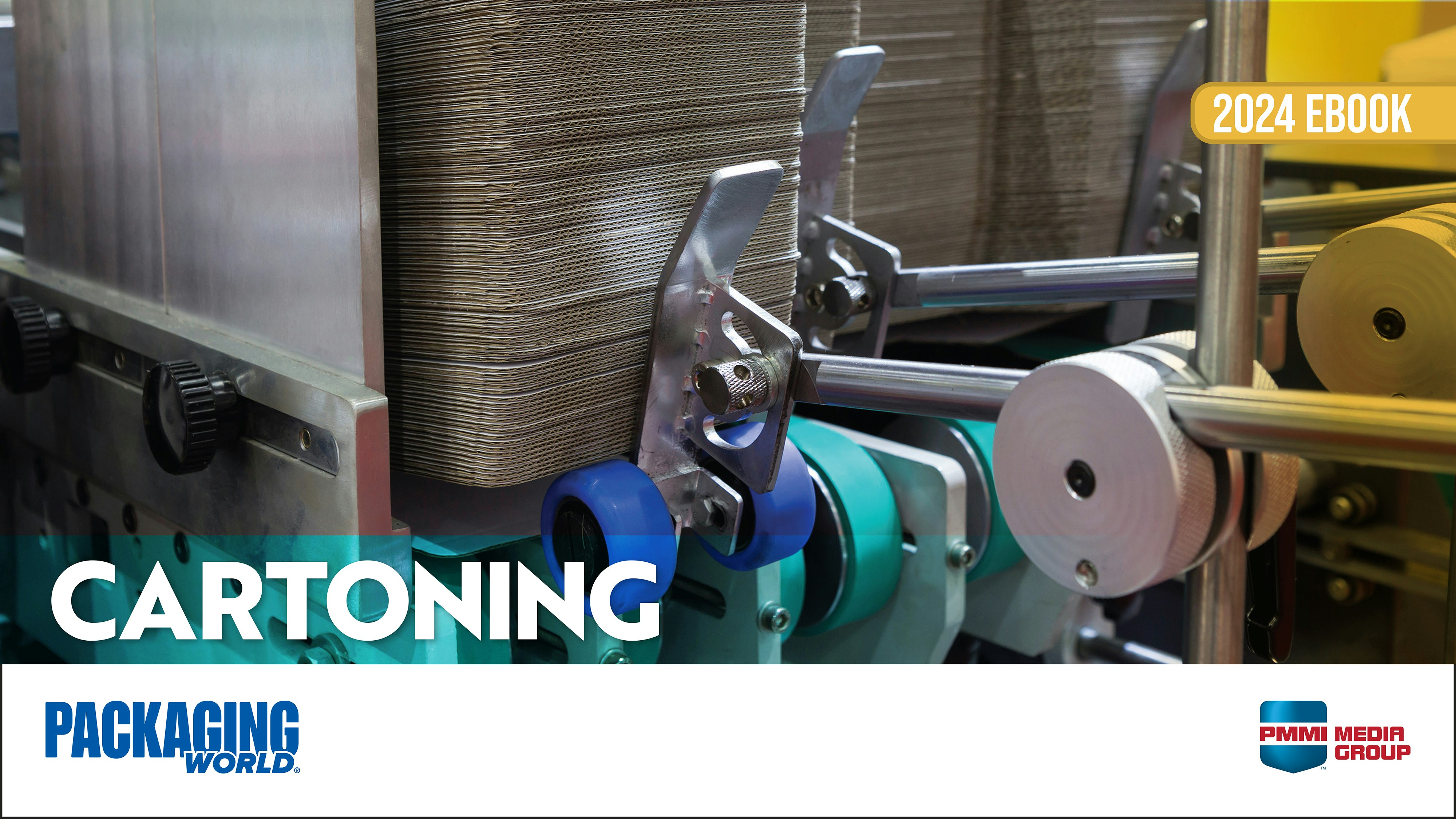
New ebook focused on cartoning equipment
Read about the various types of cartoning equipment, how to select the right one, and common pitfalls to avoid. Plus, read equipment advice from CPGs for ultimate cartoning success.
Read More
New ebook focused on cartoning equipment