That occurs when a packaged product’s design is so different that it stops shoppers in their tracks to take a closer look. This tactic can work well as long as the design keeps the product on brand and on message with the target audience.
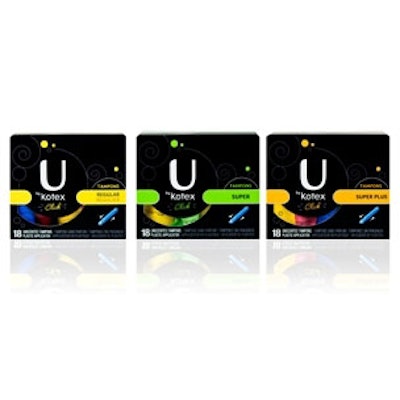
Kimberly-Clark offers a new example of aisle disruption in action with its U by Kotex line of tampons, liners, and pads. The design diverges from traditional pastel hues and floral patterns which are common in the feminine products aisle. Instead, the line’s black packaging, accented with bright colors, stands out from the crowd in targeting 14- to 22-year-olds.
“Kimberly-Clark aims to completely redefine the feminine hygiene category,” says Gregg Lipman, managing partner of CBX, the branding agency that created the design. “The challenge in doing so was pinpointing the exact visual territory for the brand.
“We strategically mapped the different personalities of women in this age group in order to drill down to the visual essence that would be most meaningful for the U by Kotex brand. The idea is to help girls and women feel empowered by providing them with opportunities to express themselves.”
The letter “U” stands out on the box as an icon for the brand. As part of the introduction, the brand’s new compact tampon, “U by Kotex Click*” Tampon is also merchandised with reusable tin containers that come in 56 different patterns for taking products on-the-go.