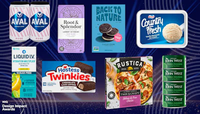
As demonstrated by the winners of NielsenIQ's Design Impact Award winners, strategic package redesigns can drive average sales increases of 4% by improving shelf visibility, simplifying shopping decisions, and strengthening brand recognition. Success requires understanding what shoppers need at each stage of their shopping journey and using research methods like eye-tracking and neuroscience testing to validate design choices before launch.
- Award-winning package redesigns show an average 4% sales volume increase in the year following introduction
- Successful redesigns balance creativity with performance across four shopper journey stages: initial approach, active shopping, purchase decision, and post-purchase brand building
- Common redesign mistakes include fixing the wrong problem—focus on competitive visibility and standout rather than just modernizing appearance
- Advanced research methods like EEG headsets and eye-tracking reveal subconscious shopper responses that surveys alone cannot capture
- Protect familiar brand assets (colors, logos, typography) while modernizing design—retention of visual equity maintains consumer trust and recognition
NielsenIQ’s 2026 Design Impact Awards reveal how smarter package design can improve shelf visibility, simplify shopping decisions, and drive sales.
A package has a lot to accomplish in the few seconds a shopper spends scanning a retail shelf. It needs to attract attention, communicate what makes the product different, and give consumers a reason to choose it over the competition. A redesign offers the opportunity to improve how well a package performs those functions, but determining which changes will make the greatest difference isn’t always easy.
For nine years, NielsenIQ (NIQ) has examined the relationship between package design and sales performance through its annual Design Impact Awards. Across nearly a decade of winners, the redesigns have been associated with an average 4% increase in sales volume during the year following their introduction.
“The original goal [of the awards], which remains the same today, was to celebrate packaging designs that deliver measurable business impact and inspire brands to think strategically about packaging,” says Andrea Fraboni, global practice lead, Pack & Design, Strategic Analytics & Insights at NIQ.
“Over time, the program has evolved beyond identifying top-performing designs to understanding why they succeed. Today, the awards not only recognize effective packaging but also highlight the design principles that drive shopper engagement, conversion, and growth.”
To identify the winners, NIQ evaluates sales performance over a full year following a redesign, accounting for broader category growth or decline to assess how the product performed relative to market conditions. NIQ also conducts independent packaging testing, including consumer surveys, eye-tracking, and neuroscience research, to understand the design decisions behind the top-performing packages.
The eight winners for 2026 span categories ranging from beverages and snacks to household products and frozen foods. Some brands made their graphics bolder and more distinctive, while others simplified cluttered layouts or brought greater attention to familiar brand assets, depending on what was needed to improve their packaging’s performance.
First, understand what needs fixing
A packaging redesign often begins with a desire to refresh a brand’s appearance, perhaps because its graphics seem dated, a competitor has introduced a striking new design, or the product category has evolved.
But Fraboni cautions against assuming that a package’s appearance is necessarily the problem. “A common mistake we see is that brands can fix the ‘wrong’ problem. By this I mean there may be a feeling that the packaging is deficient, perhaps because it doesn’t look modern, and a decision is made to redesign based on those qualitative assessments.
“However, this can result in teams spending time and money on a redesign only to find out at the end that their issue was standout, not modernity, for example. To avoid this, we recommend that brands assess their current packaging with shoppers before redesigning to have a firm idea of what’s working and what isn’t versus the competition.”
According to Fraboni, declining competitive performance and poor visibility in an increasingly crowded category are among the clearest indications that a redesign may be warranted. Regular packaging audits can help brands identify these issues before they become more significant business problems.
Design for the entire shopper journey
Understanding what’s working and what isn’t is only part of the redesign process. Brands also need to consider how their packaging performs at different points in the shopping experience.
“As teams are creating new designs, it is imperative that they are considered in the framework of the shelf and what the packaging needs to do quickly, not just upon extended exposure,” Fraboni explains. “The most successful designs balance creativity with performance.”
 NIQ’s Shopper Journey Framework identifies four stages where packaging influences consumer behavior, from attracting attention and communicating product differences at shelf to reinforcing purchase decisions and building brand equity after purchase.NielsenIQ
NIQ uses a Shopper Journey Framework to evaluate packaging at four stages. (1) During the initial approach, the package must attract attention, encourage engagement, and establish brand recognition. (2) As consumers begin actively shopping, it needs to communicate points of difference and help them distinguish among product varieties. (3) When shoppers are ready to make a purchase decision, packaging should provide reassurance and reinforce their choice. (4) After purchase, it needs to continue to build brand equity over time.
Different design elements can help accomplish these objectives. Contrast and color can attract attention, while typography, imagery, and information hierarchy can make a product’s benefits easier to understand. Which elements deserve the greatest emphasis depends on the brand, the category, and the needs of its shoppers.
Liquid I.V.: From explaining the product to building the brand
Packaging priorities can also shift as a product category evolves, as Liquid I.V.’s award-winning redesign demonstrates.
“When hydration powders first emerged, much of the packaging’s role was educating shoppers about the category and explaining the product’s benefits,” explains Fraboni. “As the category became more mainstream, Liquid I.V.’s redesign shifted toward helping shoppers quickly understand what differentiates the brand from an increasingly crowded competitive set.
“The updated design improved communication and differentiation while maintaining strong brand recognition.”
 NielsenIQ
The redesign moved from a product-first presentation, with a heavy emphasis on functional science, to a more brand-focused identity. Claim clutter was reduced, the information hierarchy became clearer, and flavor gained greater prominence. Richer colors, cleaner typography, and a more consistent visual system across the product line also helped establish a stronger brand presence.
NIQ’s evaluation found that the redesign improved perceptions of the product as premium and delicious, including an 11-percentage-point increase in association with the statement “tastes delicious.”
Hostess: Making the familiar easier to find
A redesign by Hostess for its snack cakes demonstrates a different challenge. As an established brand in a familiar category, the opportunity was not to educate shoppers but to simplify the experience.
“The redesign streamlined visual elements, created a clearer hierarchy of information, and made the package easier to process at shelf,” explains Fraboni. “By reducing clutter and emphasizing the most important messages, the packaging worked harder while remaining unmistakably Hostess.”
 NielsenIQ
The new packaging gives greater prominence to the Hostess logo and product name, supported by cleaner backgrounds, simplified framing, and prominent product imagery.
NIQ’s eye-tracking research showed that consumers viewing the original package encountered the brand later in their viewing sequence. On the redesigned package, the brand became the first element noticed. The research also found a significant improvement in brand resonance, a neuroscience-based measure of how strongly the brand registers after consumers view the package.
Know which brand assets to protect
Hostess’s decision to give its familiar branding greater prominence illustrates another consideration in package redesign: preserving the visual elements consumers already recognize.
“Successful redesigns begin with understanding which visual assets are most important to recognition and brand equity,” Fraboni says. “Those assets may include colors, logos, typography, imagery, or other distinctive visual cues.
“Modernization does not mean abandoning those elements. The strongest redesigns identify where flexibility exists and evolve the design while maintaining the cues shoppers rely on for recognition and trust. Utilizing shopper research prior to the redesign to understand what is a visual asset and where you have flexibility is key to evolving designs.”
One example of this is South African ice cream brand Country Fresh, another of this year’s winners, which expanded its signature blue across the package, increasing its shelf presence while retaining a familiar brand cue.
Research can reveal what shoppers don’t say
The consumer research NIQ uses to evaluate award-winning packaging is also available to CPG companies developing new package designs. Through its BASES Pack & Design practice, NIQ works with brands to assess existing packaging, screen and refine design concepts, and validate new designs before launch.
Its research combines traditional consumer surveys and behavioral testing with eye-tracking and neuroscience-based methods, including electroencephalography (EEG). While surveys capture shoppers’ conscious perceptions, preferences, and purchase intent, other methods can reveal how they respond to packaging without deliberate thought.
“In our packaging studies, shoppers wear an EEG headset with 32 sensors while participating in eye-tracking exercises. Eye-tracking shows where shoppers are looking, while EEG measures how their brains respond to what they’re seeing,” Fraboni explains.
 NIQ combines neuroscience-based EEG testing, eye-tracking, and consumer surveys to evaluate packaging performance, measuring everything from shoppers’ emotional responses and visual attention to their perceptions and purchase intent.NielsenIQ
“Together, these tools help us understand attention, engagement, cognitive effort, and emotional response,” she adds. “We often describe EEG as revealing the ‘reaction behind the interaction’ with pack. For example, are people leaning into the pack or pack element, or are they confused and pulling back? Is what they are seeing relevant to them? Do we see the brain having to expend a lot of effort to process?”
Each method provides a different perspective on how shoppers respond to a package, and the results don’t always align. “When results differ, they are typically not contradictory. Instead, they provide insight into where a package is succeeding or struggling,” Fraboni says. “For example, a package may be highly visible on shelf but less effective at communicating key messages once a shopper picks it up, so we may see shelf standout/eye-tracking is strong and communication scores are weak from the survey. Understanding those nuances helps brands identify opportunities for improvement.”
Putting a redesign to the test
As a redesign moves closer to completion, the focus of research shifts from developing and refining concepts to determining whether the new packaging is ready for market.
Fraboni recommends conducting the most rigorous validation testing once a brand has narrowed its choices to one or two final designs. At that point, the package should be evaluated across the entire shopper journey, particularly how it performs alongside competing products in a realistic shelf environment. A design that looks attractive on its own may be difficult to notice or recognize when surrounded by competing brands.
Validation can also identify potential problems before a company commits to launching its new packaging. According to Fraboni, declines in measures such as visibility, findability, communication, or purchase intent are warning signs that a proposed redesign needs further work.
While this final round of testing can help prevent costly mistakes, the research that shapes a successful redesign begins much earlier.
“Start with foundational research,” advises Fraboni. “Before changing a package, understand what is currently working, what is not, and ensure you have a good understanding of your visual equities. Brands that build redesign strategies on a foundation of shopper insight are more likely to create meaningful improvements and achieve stronger business results.” PW
Eight Award-Winning Redesigns and Why They Worked
NIQ’s 2026 Design Impact Awards recognize eight brands whose package redesigns delivered measurable commercial results. Each offers a different lesson in how design can influence shopper behavior.
Aval French Cider: The Standout Award
 NielsenIQ
Aval increased contrast between its logo and background, enlarged and centered the brand mark, and removed competing graphics to create a stronger focal point. The result is a package that’s easier to recognize from a distance. NIQ’s research also found improved perceptions of the cider as refreshing, unique, and premium, along with a 10-percentage-point increase in association with “elevates everyday occasions.”
Rustica Pizza: The Differentiator Award
 NielsenIQ
McCain Foods’ Rustica brand moved away from conventional frozen-pizza graphics to establish a more distinctive personality. Immersive food photography, expressive visual elements, and clearer color and text cues for varieties help consumers distinguish products at shelf. NIQ’s predictive eye-tracking analysis showed that the redesign broadened visual attention across brand and flavor information instead of concentrating it on a few small elements.
Hostess Cakes: Master of Focus
 NielsenIQ
Hostess simplified its packaging to make the brand and product unmistakable. Removing competing graphics, strengthening the logo’s prominence, and establishing a clearer information hierarchy helped consumers process the package more quickly. NIQ’s testing showed that the redesigned package brought the brand to shoppers’ attention earlier and significantly improved brand resonance.
Liquid I.V.: The Category Creator
 NielsenIQ
As hydration powders moved into the mainstream, Liquid I.V. evolved its packaging from a product-education tool into a stronger expression of brand identity. Reduced claim clutter, a more prominent logo, richer colors, and clearer flavor differentiation helped consumers navigate an increasingly crowded category. NIQ recorded an 11-percentage-point improvement in association with “tastes delicious.”
Root & Splendor: The Glow Up
 NielsenIQ
Root & Splendor transformed its household-product packaging from a label-led presentation into a cohesive communication system. The design makes fuller use of the package, establishing a clear focal point supported by imagery and colors that communicate scent and product variety. Research showed 11-percentage-point improvements in perceptions that the product is high quality and removes stains effectively.
Back to Nature: The Craveable Breakthrough
 NielsenIQ
Back to Nature challenged the restrained visual conventions often associated with better-for-you snacks. Larger, more appetizing product imagery, bold colors, and playful language brought greater personality and indulgence appeal to the packaging while retaining its health positioning. The redesign generated an 11-percentage-point increase in purchase intent in NIQ’s testing.
John West Tuna Chunks: The Less Is More Award
 NielsenIQ
John West demonstrated how eliminating packaging material can improve communication as well as reduce unnecessary packaging. Removing the outer plastic wrap from its multipacks made the four individual cans visible, while stronger typography emphasized the tuna product itself. NIQ found a 10-percentage-point increase in consumer association with the statement “provides a good source of protein.”
Country Fresh Ice Cream: The Sweet Spot Award
 NielsenIQ
DairyMaid’s Country Fresh ice cream refreshed its long-established identity without sacrificing familiarity. Expanding the brand’s signature blue across the package, simplifying decorative elements, and featuring larger product imagery increased shelf presence and appetite appeal. The redesign retained the brand’s family-friendly associations, with 99% of surveyed consumers agreeing that the packaging conveyed a product that is “a treat for the whole family.” PW