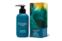
Abandoning the natural Kraft paper and muted color tones typically used to package natural products, Nancy Twine, CEO and founder of Briogeo, says she opted for bright colors and striking patterns for her new line of natural hair-care products to appeal to a new demographic of female consumers as well as differentiate her line on shelf.
“I am marketing Briogeo toward the modern, chic, extremely ingredient-savvy, health-conscious, beauty-conscious consumer, and she’s into packaging,” says Twine. “She wants that bottle she puts into her shower to be fun and vibrant. She wants to feel like she is buying a present or gift for herself.”
The Briogeo line, launched in fall 2013 in several high-end beauty and fashion outlets, cosmetics stores, and online, comprises four products formulated to address a diverse range of hair texture types. The products contain at least 95% natural and naturally derived ingredients, such as plant and fruit extracts, oils, antioxidants, and vitamins.
The line was inspired by Twine’s childhood experiences, where her mother—a chemist and doctor—made most of their beauty products in the kitchen. At the time, Twine says, “it was a very underground kind of thing to do.” With the emergence of today’s health-conscious consumers, however, Twine says she felt the time was right to introduce such homegrown, natural products to a new demographic.
Packaging comes first
In launching her new line, Twine says she focused on the packaging first, before the product formulas were even finalized. “I wanted Briogeo to be something bigger than a lot of mom-and-pop natural brands you see on the shelf,” she explains.
In addition to wanting a package that spoke of luxury and prestige, Twine also sought to distance her product line from “the overuse of earth tones, muted colors, Kraft boxes, and leafy patterns,” she says. “In a lot of ways, natural products started to blend on-shelf. Method, with its natural home-care cleaning products, was one of the first brands to really break out of that norm by using non-typical product packaging and bright colors. They had a lot of success doing that, and it was in line with where I wanted to drive Briogeo.”
To help bring that vision to life, Twine enlisted the expertise of Flood Creative NY—a graphic design firm that works with a number of top-tier CPG brands. Finding kinship with Briogeo due to its similar entrepreneurial background and excited by the design freedom afforded by a start-up brand, Flood worked with Twine to accommodate her limited budget.
“The firm was really great in that they gave me a lot of different concepts to evaluate,” says Twine. “I told them that I wanted patterns, I wanted colors that transcended the typical natural norm, and I wanted to use stock bottles. Then they came up with tons of ideas from there.”
Bright colors, patterns
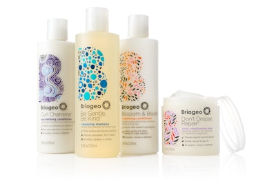
To keep packaging costs manageable and ensure a simple bottle structure, Flood and Twine chose a translucent 8.5-oz high-density polyethylene bottle from M&H Plastics that uses 25% post-consumer recycled plastic. Twine says her goal was to use more PCR, but experimentation showed that more than 25% resulted in a greyish tint to the bottle.
For the graphic pattern, Flood offered a unique and relevant twist. Says Designer Joli Glantz, “We were inspired by the balance of nature and performance. A large ‘B’ icon is made of organic yet considered patterns to reflect either a unique hair type or hair benefit.” For Be Gentle, Be Kind cleansing shampoo, Flood designed a pattern of bubbles in a range of blue shades; for Blossom & Bloom volumizing conditioner, a flower pattern in orange, pink, and black; Curl Charisma curl defining conditioner is a pattern of tress-like swirls in purple and blue; and Don’t Despair, Repair! deep conditioning mask (in a jar) uses a stylized rosehip-leaf pattern in orange, purple, and black.
To reflect the amount of consideration put into each product formula, Glantz says that Flood treated superiority claims in a more scientific fashion on the front of the bottle. Checkmark, leaf, and droplet icons tick off the benefits of each product under each the brand icon and product name.
Giving Twine the color she desired, the white bottles are silkscreen-printed in three to four colors, including multiple Pantone colors.
‘Overwhelmingly positive’ reaction
Since Briogeo was introduced, Twine says the line has received a significant number of positive comments on social media and “tons of great press” from the print media. “The reaction has been overwhelmingly positive,” she says. “People can’t believe how much traction the brand has gained in just six months.”
Briogeo’s products are all priced at under $30, ranging from $19 to $26.
To see a spin + zoom 360° photo, click here.