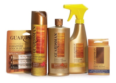
The brand was founded in 1915 in Grand Rapids, MI, and Valspar Corp. wanted to make it more contemporary.
Consulting the services of Flowdesign (www.flow-design.com), Valspar solidifies Guardsman’s premium image in a number of new ways through packaging colors, fonts, photography, and materials. Foremost, the packaging features photography of premium-cut polished wood, with the Guardsman logo repositioned and increased in size.
The can’s background blends light and dark copper tones, and the cap is finished with a contemporary-looking one-piece sprayer unit. These new packaging colors support the brand’s longtime copper-colored logo, says Valspar spokesperson Tracy Stark.
The can is high-density polyethylene, and the new all-in-one sprayer cap is PET, replacing a standard paint-sprayer cap.
Guardsman follows this design template across its range of products, using different photos for each product.