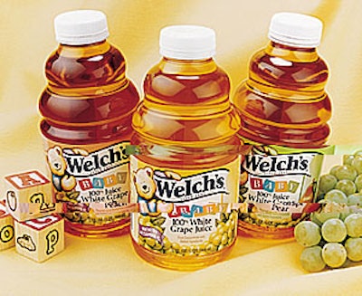
According to Paula Elrod of Bailey, designers wanted to communicate a feeling of fun to accompany important messages such as health and quality. “We were looking for something that would attract mothers,” she says. “Perhaps something with a serious nature yet with fun elements.” The fun elements she refers to include a cuddly teddy bear mascot and mild pastel colors. The 32- and 64-oz bottles are decorated with wraparound labels printed offset in four colors. Each of the three different flavors has its own spot color.
Companies in this article