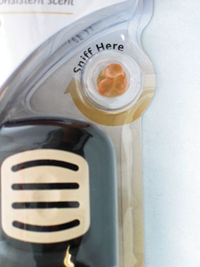
Because it has been improved with this redesign, perhaps it can now be called a grand slam. Gondak points to two improvements that were made to the sniffer hole:
- It was relocated from the bottom left to the center right to where someone would pick up the package, thus encouraging crucial consumer-product interaction.
- The copy was enhanced and a printed racing arrow was added to draw attention to the feature.
“In the old package, the sniffer hole was located in the bottom left—maybe not the intuitive place a consumer would grab it,” Gondak explains. “We relocated it to the center right where a right-hand consumer would hold the package.” These changes serve to direct the consumer to this interactive feature. “We are trying to pull people towards the [printed] arrow as a differentiator at the shelf for a feature that isn’t used by our competition,” Gondak points out. “If we could get a consumer to touch it and pick it up, we had a higher likelihood of a sale.”
The odds of that happening have been increased with the new design. Moving the scent feature also provides room at the package base for more copy than before. “We have a lot of ground to cover in a small footprint,” notes Gondak. “Being able to use that bottom space a little bit more optimally to communicate helped us a lot.”